Green painted dining rooms range from bold wraps in a single shade to half-painted walls split at chair rail height, with choices spanning sage, olive, and pale green.
Wainscoting painted darker than the walls above it gives you a layered look, and wall paneling works in older homes where flat drywall feels too plain.
1. Walls, Woodwork, and Ceiling in One Green

Painting walls, trim, and ceiling in a single green creates a room wrapped in color rather than broken into pieces.
High-gloss finishes like this one catch light and bounce it around, which helps in smaller dining rooms or spaces with limited natural light.
Committing fully is what makes it work: half measures read as timid, but a room done in one saturated shade feels intentional. Lime and chartreuse greens lean modern, while deeper tones like forest or hunter green suit traditional spaces.
Prep matters more with gloss finishes because every flaw shows. Sand and prime carefully, and plan for 2 coats.
2. Bold Green Wallpaper
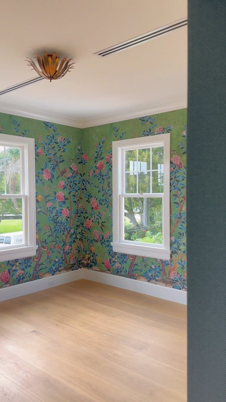
Wallpaper delivers pattern and scale that paint alone cannot. A bold floral print like this one turns plain walls into a focal point without requiring furniture or art to carry the room.
Green patterns work in dining rooms that see occasional use rather than daily wear, since wallpaper costs more to replace than paint.
Peel-and-stick versions come down without damage, which suits renters or anyone testing a look before committing to traditional paper.
Measure your wall area before ordering: you will need extra for pattern matching on large repeats.
3. Green-painted Banquette
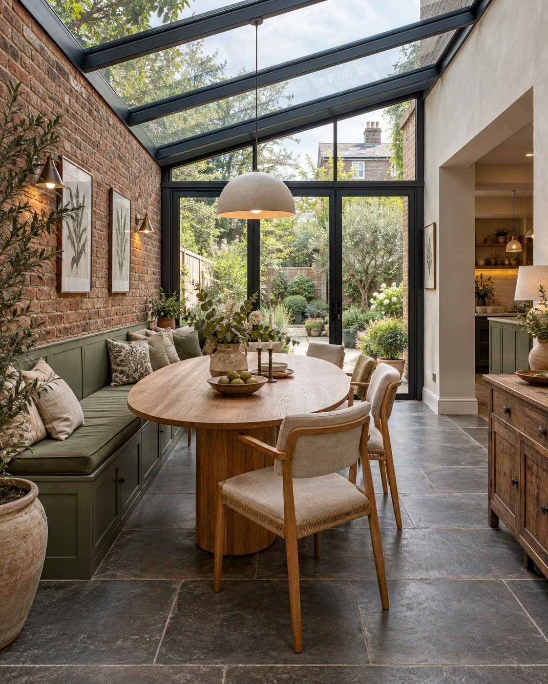
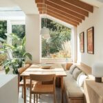
A banquette painted in green anchors a dining area and carries less visual weight than a full wall. Built-in seating works in breakfast nooks, sunrooms, and kitchen-diners where space is tight and a standard dining set feels crowded.
Green banquettes pair well with natural wood tables and brick or stone walls, keeping the look grounded rather than overly styled.
Paint the cushion base and leave the seat upholstered in a neutral fabric, or go full color with green cushions if the rest of the room stays light.
4. Green with Wood
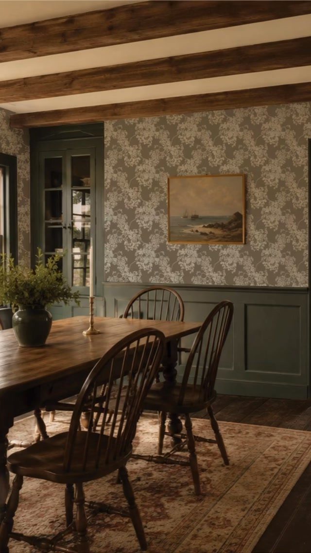
Green and wood is a pairing that spans styles: wainscoting with exposed beams reads traditional, while flat green panels with light oak furniture leans contemporary.
The material combination works because green sits next to wood tones in nature, so the eye accepts it without question.
Wainscoting like this one gets painted in a darker or more saturated green than the walls above it. The wood ceiling beams stay natural or get stained to match the table and chairs.
If your dining room lacks architectural detail, adding wood trim or picture frame molding before painting gives you the same layered effect.
5. Luxe Green Dining Room
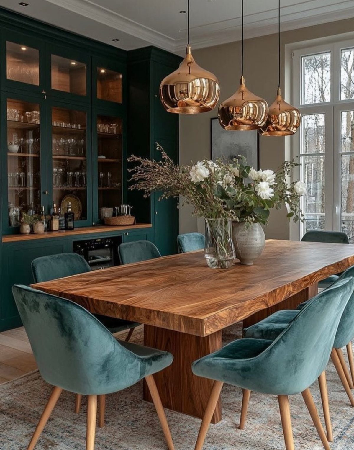
Deep greens like teal and emerald turn a dining room into a jewel box, especially when paired with rich materials.
Velvet upholstery, brass or copper light fixtures, and live-edge wood tables all amplify the luxe effect without requiring a large budget.
Built-in cabinetry painted in the same deep green as the walls creates a cohesive backdrop and provides storage for tableware and glassware.
If you do not have built-ins, painting a hutch or sideboard in the same color gives you a similar anchored look.
Plan for 2–3 coats when working with deep saturated colors, and use a tinted primer to reduce the number of topcoats needed.
6. Two-tone Half-painted Green Walls
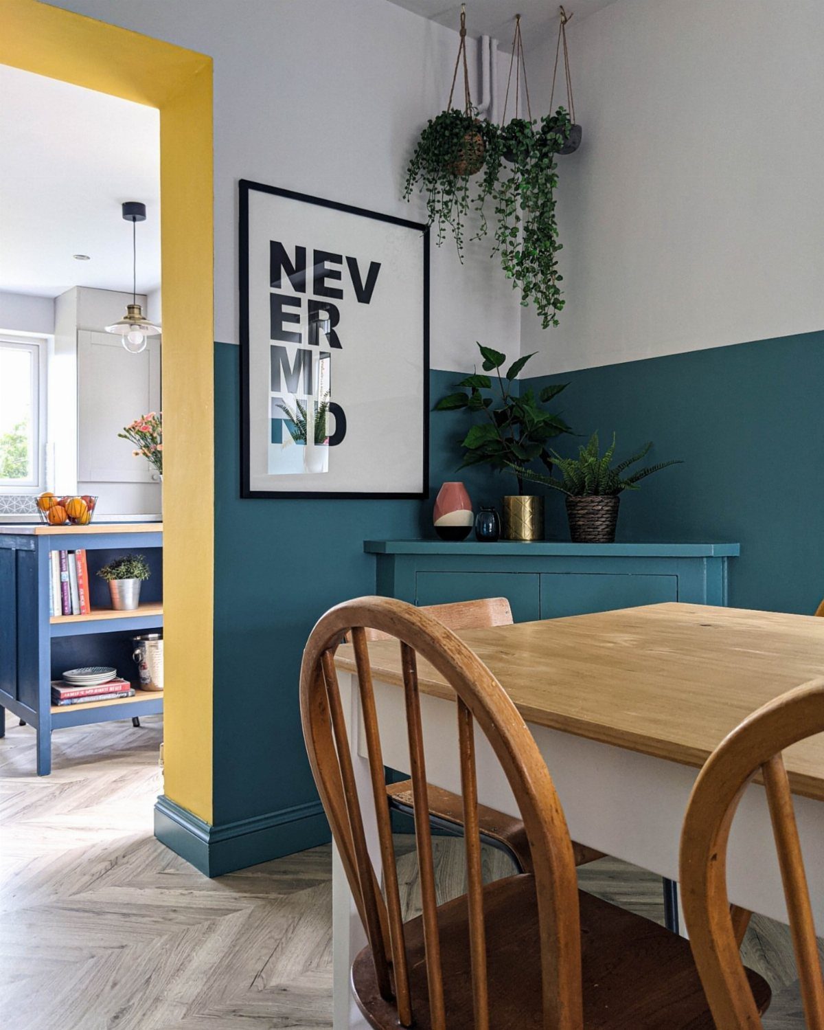
Half-painted walls divide the room horizontally, with white or cream on top and a saturated green below. The split aligns with chair rail height if you have one or want to add trim at the break.
Dark teal on the lower half hides scuffs and marks better than full white walls, which matters in high-traffic dining areas or homes with kids.
The white upper section keeps the room feeling taller and brighter than it would with green running floor to ceiling.
Tape off a clean line at your chosen height, and paint the lighter color last so any bleed from the darker section gets covered.
7. Green Painted Fireplace Accent
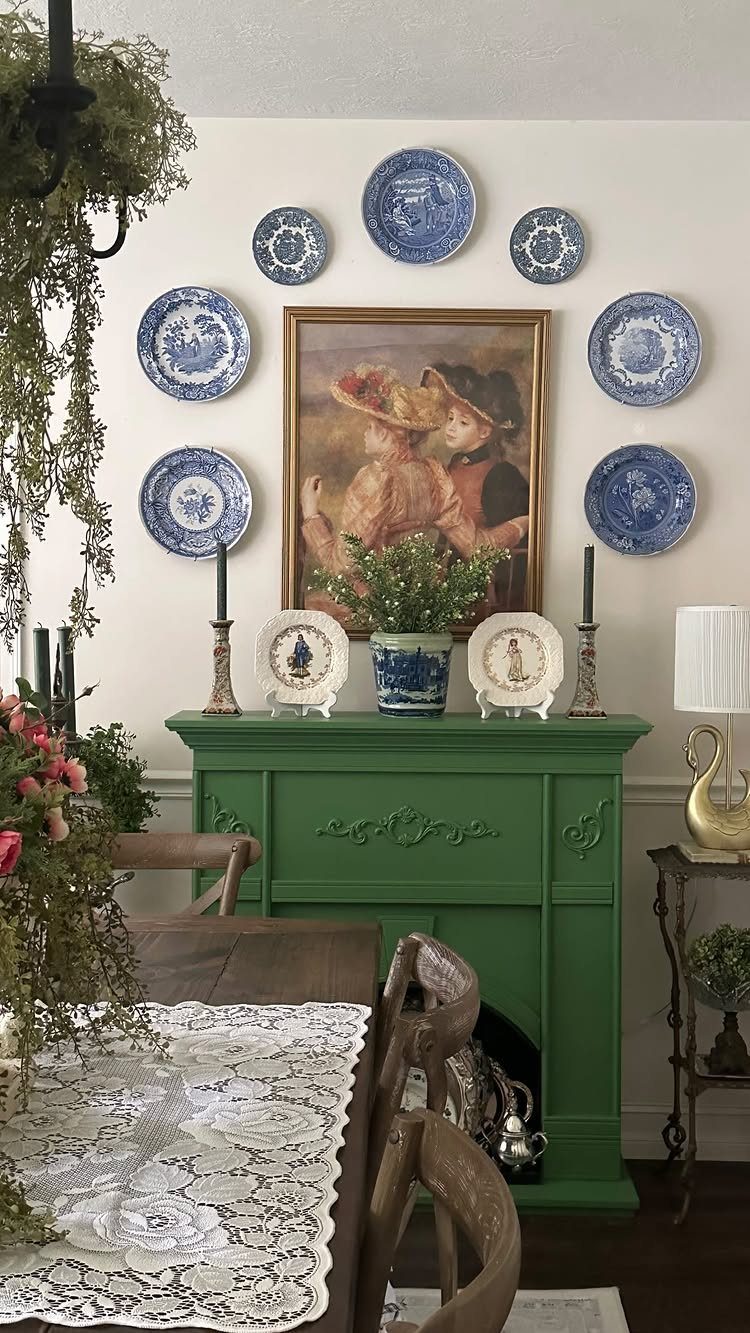
Painting a fireplace mantel in green turns an architectural feature into a focal point without committing every wall to color.
The mantel becomes a display surface for white or patterned dishware, art, and candles, with the green backdrop framing the arrangement.
If your fireplace is brick, paint the mantel shelf and surround but leave the brick exposed for texture contrast. On a fully painted surround, use satin or semi-gloss for easier cleaning since mantels collect dust and fingerprints.
One coat of primer and 2 coats of paint cover most mantels in an afternoon.
8. Sage Green Dining Room
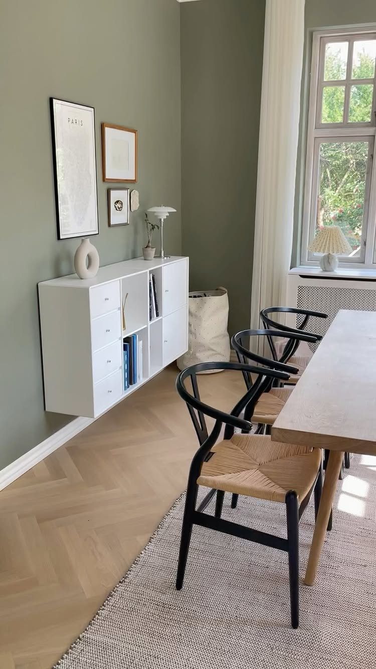
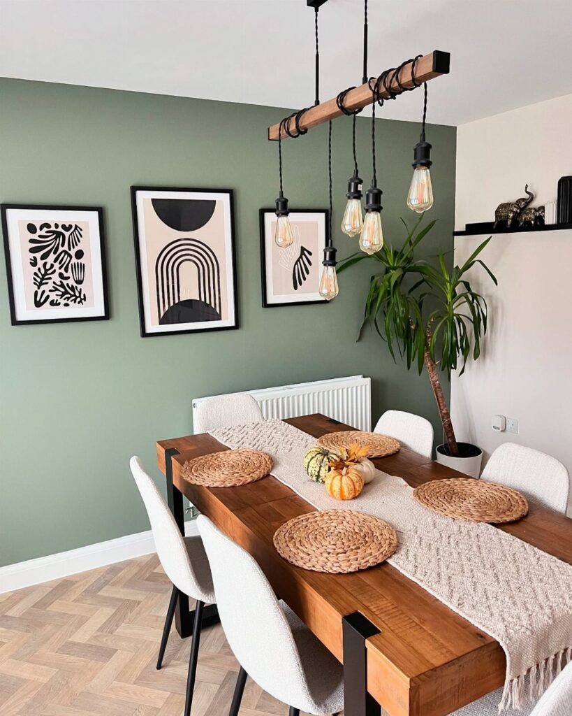
Sage green sits between gray and green, reading neutral enough to live with daily but distinct enough to register as color. It pairs well with black metal chairs and light wood tables, keeping the palette grounded without heavy contrast.
This shade works in rooms with good natural light, where it stays soft rather than going muddy. In north-facing rooms or spaces with small windows, sage can read flat; test a sample board first.
Pair sage walls with white trim and neutral upholstery to keep the room from skewing too earthy.
Using the color green is a great way to bring the outdoors inside. It can make a dining room feel fresh and calming, especially when using shades like sage or mint.
9. Olive Green Dining Room
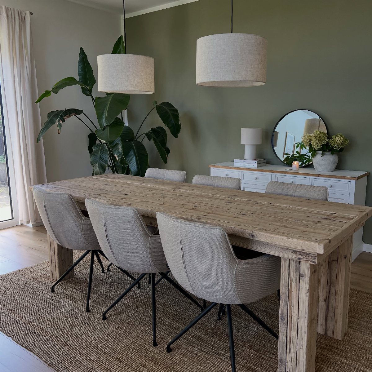
Olive green runs warmer and deeper than sage, leaning brown rather than gray. It suits dining rooms with rustic or industrial furniture, where the color anchors heavier wood tables and metal light fixtures.
The shade holds up in rooms with warm overhead lighting but can feel dark in spaces without windows.
If your dining room doubles as a passthrough, olive on one accent wall rather than painting the whole room keeps the space from closing in.
A tinted primer cuts the number of topcoats you’ll need.
10. Pale Green Dining Room
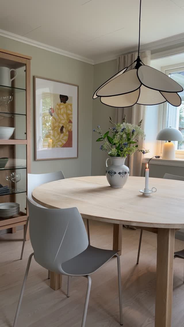
Pale green barely registers as color until you compare it to white. It softens a room without reading as pastel, and it pairs well with light wood furniture and sculptural light fixtures that need a backdrop without competing for attention.
This shade works in small dining rooms or open-plan spaces where a saturated color would feel too heavy. It reflects light well, which helps in rooms with limited windows.
If pale green reads too cool, warm it up with wood tones and linen textiles rather than switching to a different paint color.
11. Green Paneled Walls with Bold Accents
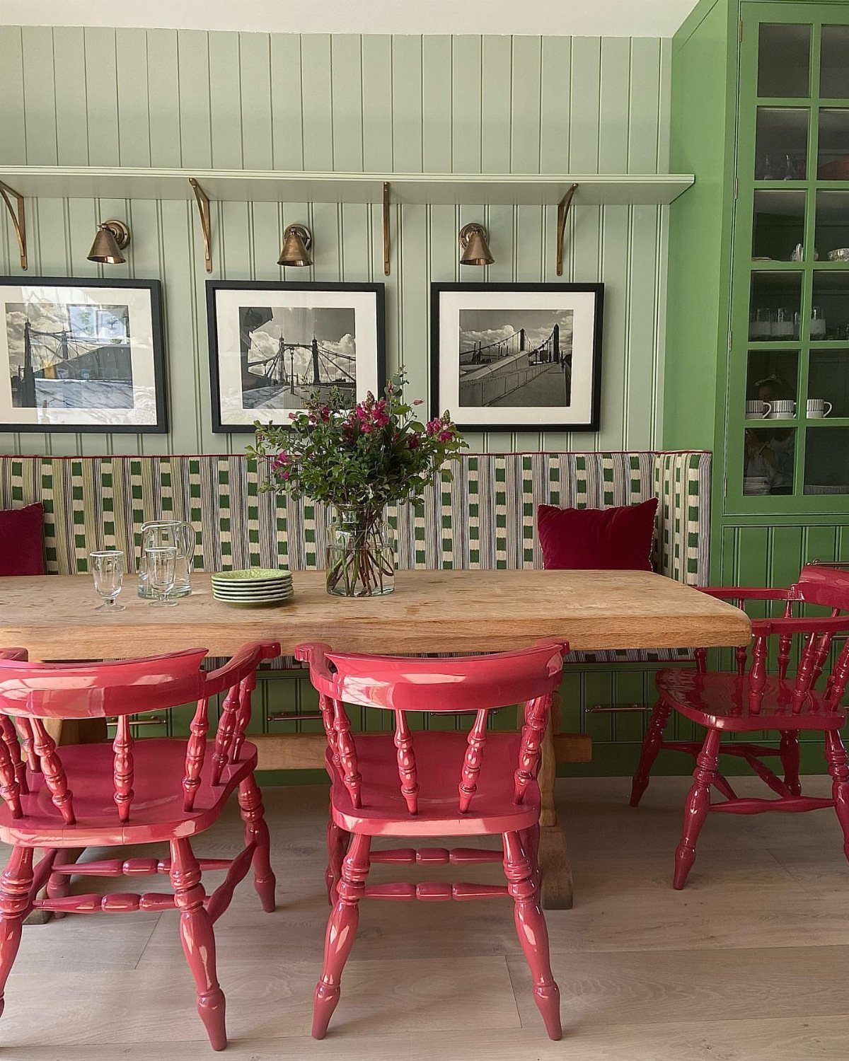
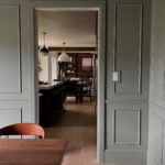
Wall paneling in light green gets its contrast from furniture, not from the walls themselves. Bright pink chairs or bold upholstery pull focus and keep the room from reading too monochrome.
Paneling adds texture and breaks up flat drywall, which suits older homes or spaces with minimal architectural detail.
You can install picture frame molding or board and batten and paint it the same color as the walls for a cohesive look.
If bright chairs feel like too much, swap in patterned cushions on neutral frames instead.
Psychological Impact of Green
Green registers as restful because it sits at the center of the visible spectrum, requiring less eye strain to process than warmer or cooler hues.
That physical ease translates to psychological calm, which makes it a practical choice for dining rooms where you want conversation to settle rather than spike.
The color’s association with nature reinforces that effect. Rooms painted in green feel grounded without reading as heavy, and they pair well with organic materials like wood, linen, and stone that echo the same outdoor reference.
Green also reads as generous, which suits a room built around gathering and sharing food. Deeper shades like forest or emerald feel more formal and enclosed, while pale or mid-tone greens keep the mood casual and open.
Frequently Asked Questions
What are the best green paint colors for a dining room?
Sage and olive greens work well in most dining rooms because they sit close to neutral while still reading as color.
Lime and chartreuse skew contemporary, while forest or emerald greens belong in formal settings. The shade you pick should match the mood you want: pale greens feel open and casual, while deep saturated tones create a more enclosed, intimate room.
Which color is suitable for dining?
Green works well in dining rooms because it reads as restful and sits at the center of the visible spectrum, requiring less eye strain than warmer or cooler colors.
It pairs naturally with wood, linen, and stone, and the range of shades lets you set the mood from casual to formal.
Pale greens hold the room open and airy, while deeper tones like teal or emerald close in with intimacy.