Wall decor that reflects light back into the room makes the space feel larger than anything that just hangs flat, which is why mirrors and sconces show up in half the ideas here.
The choice between a single oversized piece and a collection of smaller frames comes down to whether you have furniture anchoring the wall below: a sideboard or buffet calls for coverage that spans 60–80% of its width, while an open wall can handle one statement mirror or canvas hung at eye level.
Treatments range from peel-and-stick botanicals that remove cleanly to marble panels with hardwired sconces that require an electrician and a weekend to install.
1. Statement Wallpaper
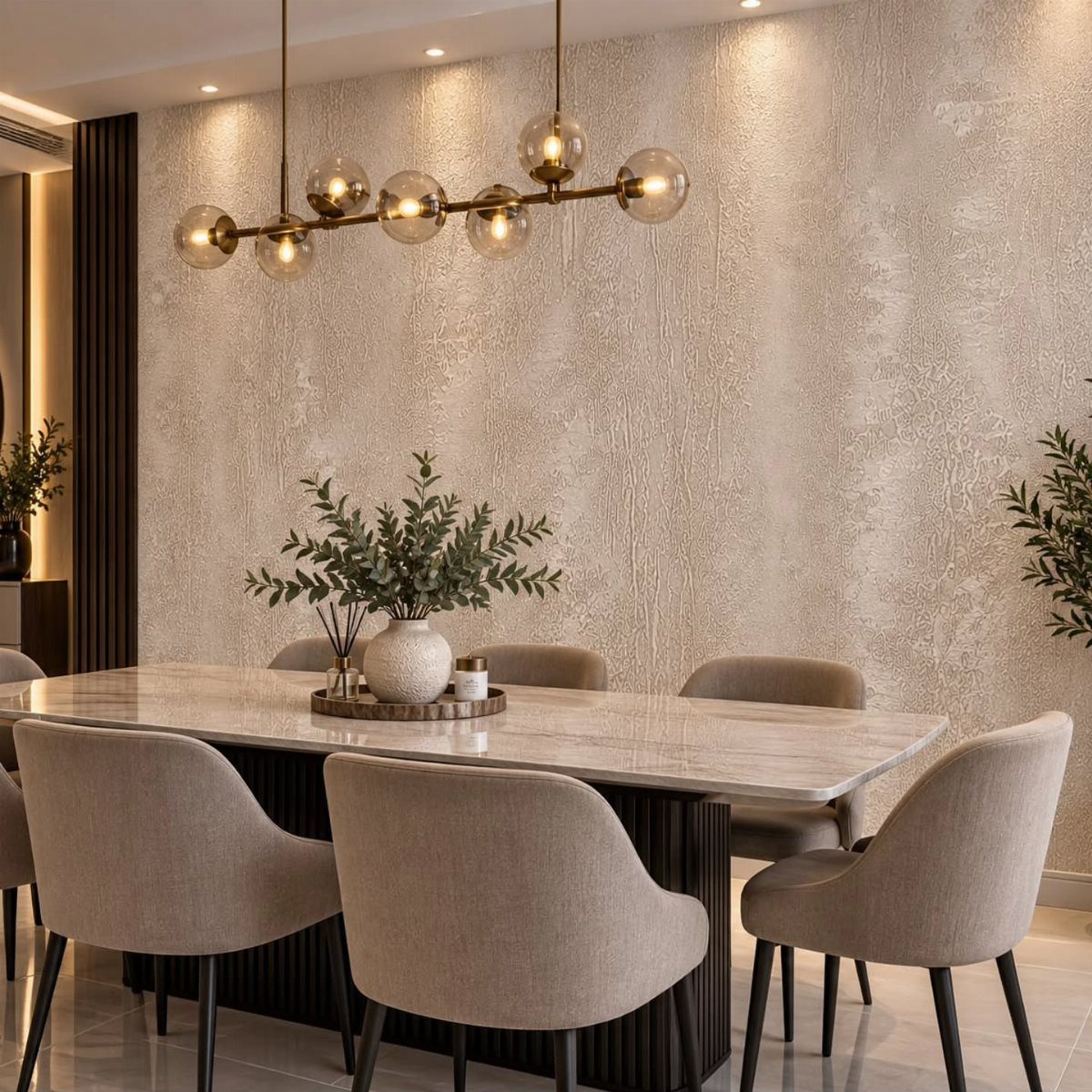
A textured wallpaper in a neutral tone covers one wall and adds depth without competing with the furniture or lighting.
The pattern here reads as subtle from across the room but has enough relief to catch light and shadow up close.
This works well in rentals if you use peel-and-stick versions, which come off cleanly when you move. For owned homes, traditional paste-applied wallpaper gives you more pattern choices and tends to last longer.
Pick a single accent wall rather than wrapping the whole room. That keeps the look grounded and saves you from cutting around outlets on every surface.
2. Oversized Mirror
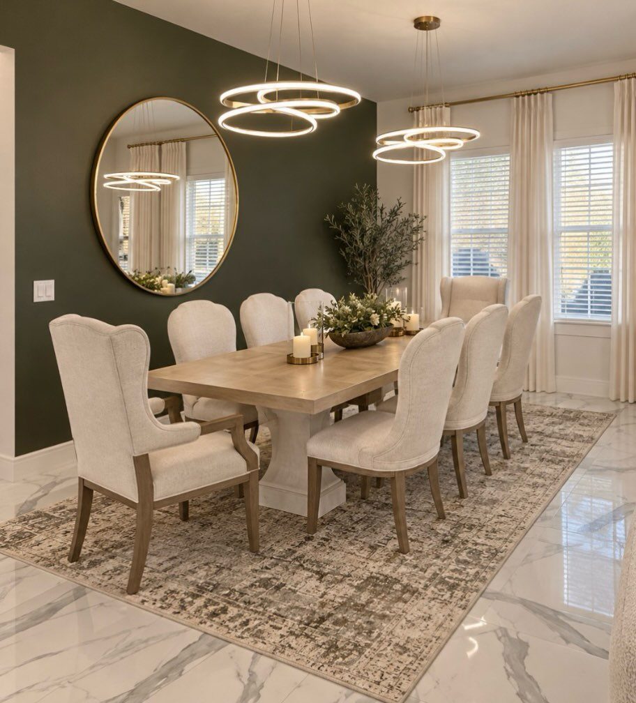
An oversized mirror reflects light from windows or fixtures and makes the room feel twice as wide.
Hang it at eye level or slightly above, centered on the wall. If the mirror sits too high, it reflects the ceiling instead of the room, which kills the spacious effect.
Look for mirrors tall enough to anchor the wall without getting lost beside the furniture. Anything smaller reads as decorative rather than architectural, and you lose the impact.
3. Mix High-impact Upgrades
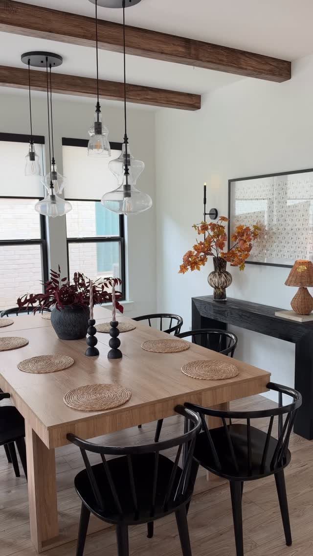
Framed art and a console table anchor the wall beneath exposed wood beams, combining structural detail with personal style.
If you have architectural features like beams or paneling, work with them instead of covering them up. Add art that complements the scale: in a room with strong horizontal lines, vertical frames balance the space.
A lamp and seasonal flowers on the console soften the look and give you flexibility to change the display without touching the walls.
4. Art by Theme
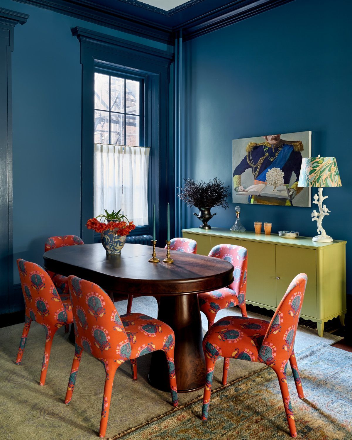
A single large painting sets the tone for the room and pulls the color scheme together. Here, the military portrait introduces formality that matches the dark wood and rich blue walls, and the frame ties into the sideboard below.
Choose art that reflects how you actually use the space. A formal dining room can handle traditional portraiture or historical subjects; a casual eat-in area might lean toward landscapes or abstract pieces.
Scale matters more than style. One oversized piece anchored above a sideboard or buffet looks intentional, while a small print on a big wall feels lost.
5. Use of Textures
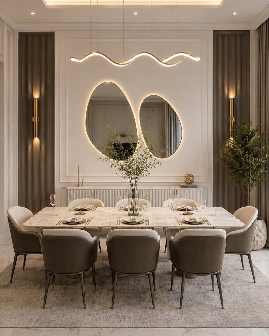
Fluted wood panels add vertical texture that changes as light moves across the room.
The grooves create shadow lines that make a flat wall feel sculptural, and the natural finish warms up the marble and metal in the rest of the space.
Install these panels floor to ceiling for the cleanest look, or run them as a wainscot to keep paint or wallpaper above. Most panels attach directly to drywall with adhesive and finish nails.
This treatment works best on one accent wall. Wrapping the whole room can feel heavy unless the ceiling is high and the space gets plenty of natural light.
6. Framed Family Photos
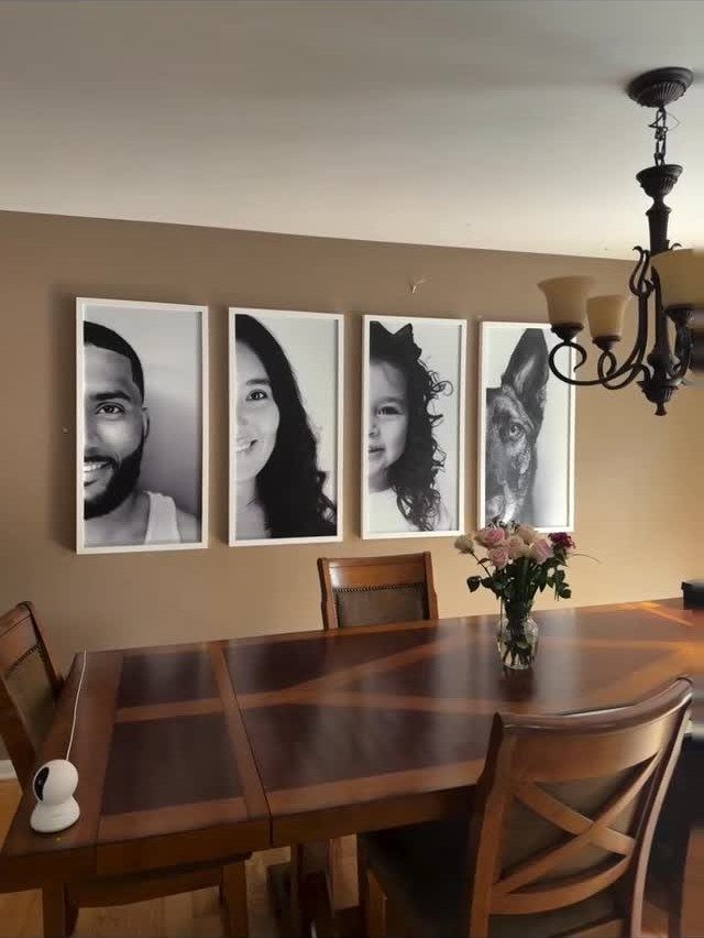
Framed portraits in black and white create a personal gallery on the dining room wall. The white frames stand out against the warm brown paint, and the monochrome treatment unifies different photos taken at different times.
Match the frame sizes and hang them in a straight line for a clean, symmetrical look. If your photos vary in orientation, arrange them by height so the tops or bottoms align.
Black and white printing smooths out differences in lighting and background, which matters when you are displaying family snapshots alongside professional portraits.
7. Framed Recipes
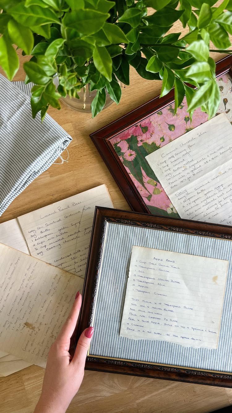
Handwritten recipes in matching frames turn family favorites into personal art. The dark wood frames pull together different handwriting styles and paper tones, so cards from different decades look like they belong on the same wall.
Arrange them in a grid or lean a few against the wall on a shelf if you prefer to swap them out seasonally. This works well in rentals since frames hang on standard picture hooks.
Choose recipes you actually make, not ones that sound impressive. The details matter more than the dish.
8. Gallery Wall
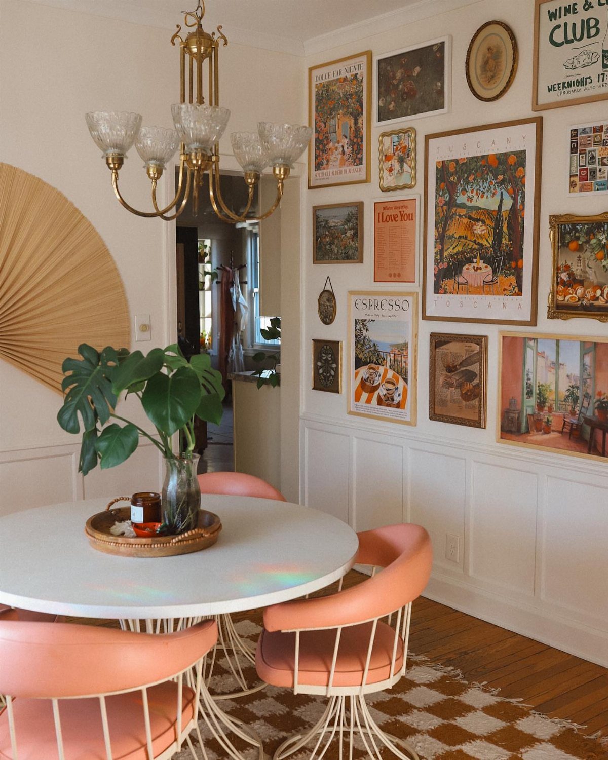
A mix of frame sizes and art styles fills the wall without following a rigid grid. The frames here vary in color and width, but the spacing between them stays consistent, which keeps the arrangement from looking chaotic.
Lay the pieces out on the floor first and adjust until the overall shape feels balanced. Hang the largest piece first, then build outward.
Mixing travel posters with abstract prints and photography gives you flexibility to add new pieces over time without starting over.
9. Sculptural Art
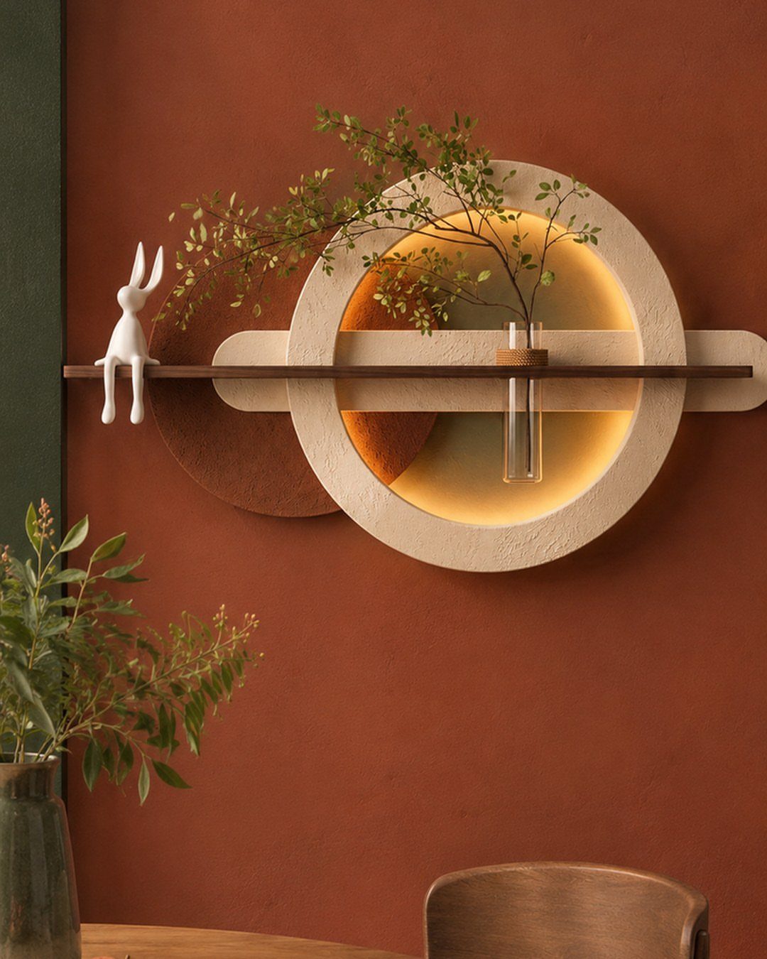
A circular wall sculpture adds depth that flat art cannot match. The textured surface catches light differently throughout the day, and the built-in shelf holds a small plant or decorative object without taking up floor space.
Mount it at eye level so the detail reads clearly from the table. Heavier pieces need wall anchors rated for the weight, not just drywall screws.
This approach works best on an otherwise empty wall, where the sculpture can stand as the focal point rather than competing with other decor.
10. Chic Indoor Greenery
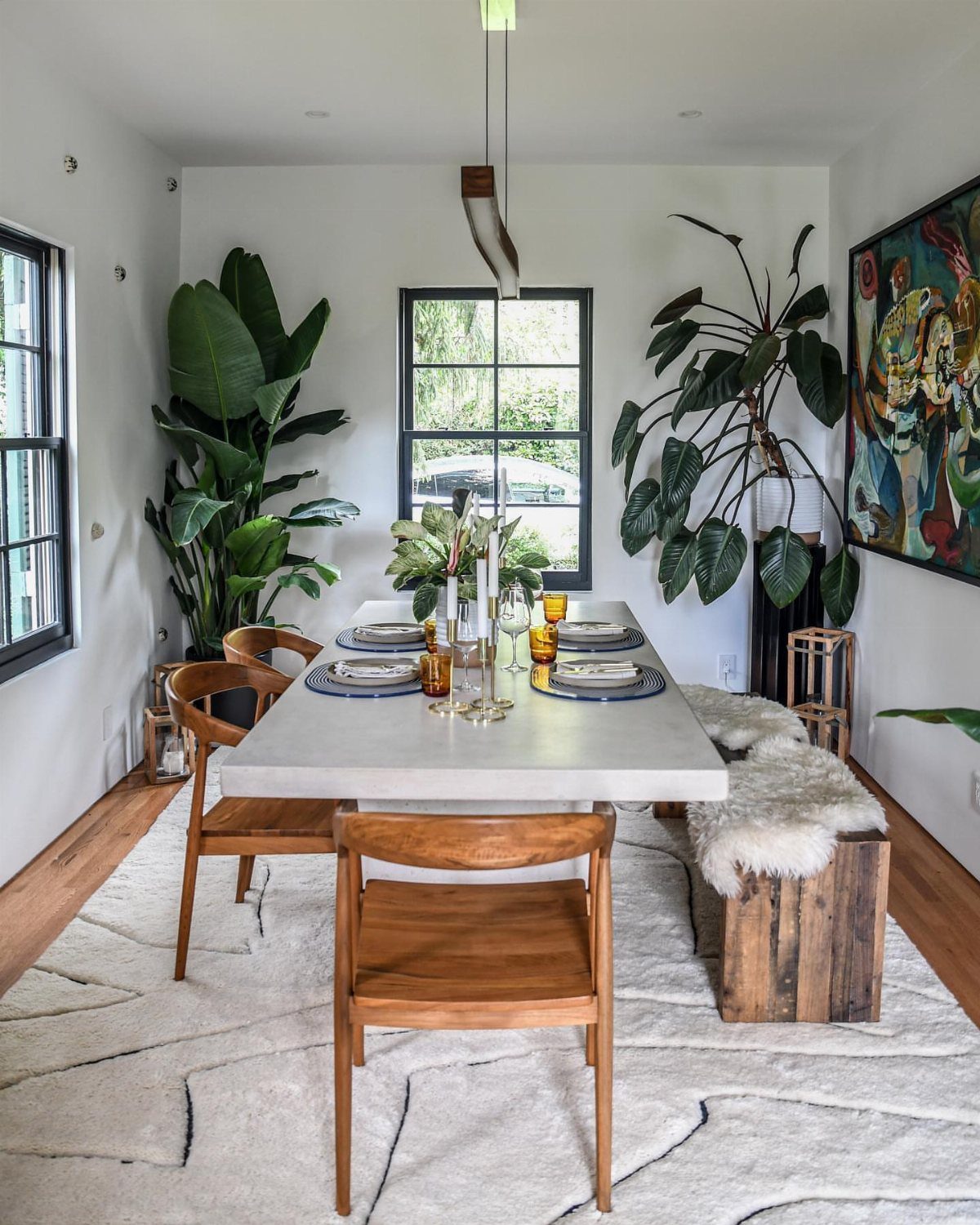
Large potted plants on either side of the window bring life to the wall without requiring tools or picture hooks. The vertical growth lifts your sight line and softens hard edges around the table and chairs.
Choose plants that tolerate the light your dining room actually gets. Low-light corners need pothos or snake plants; bright windows can handle fiddle-leaf figs or rubber trees.
Floor planters work in owned homes and rentals alike, and you can take them with you when you move.
11. Plate Display
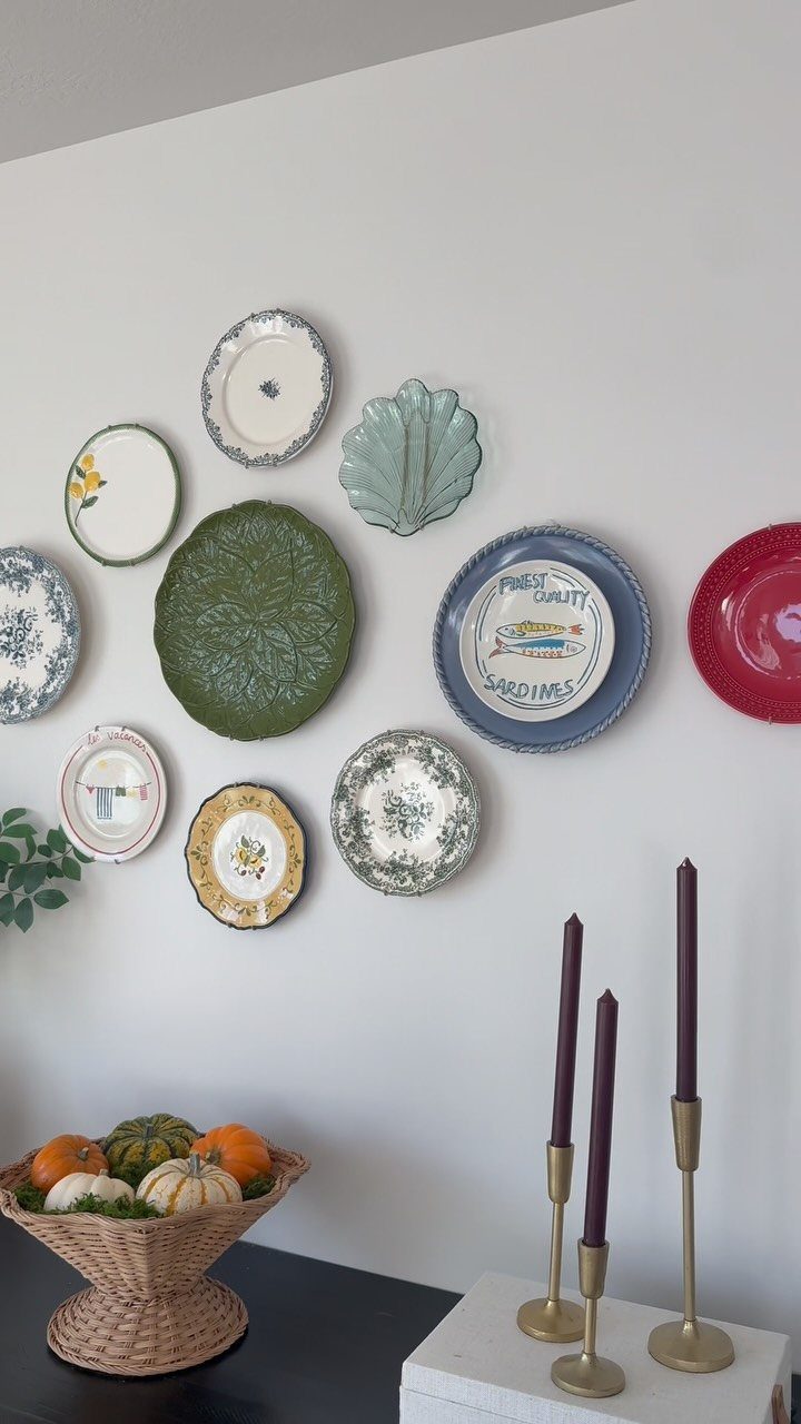
Decorative plates arranged on the wall add color and pattern without the formality of framed art. The mix of sizes and designs here creates visual interest, and the plate hangers stay hidden behind the rims.
Use adhesive disc hangers for lightweight ceramic plates and wire hangers for heavier stoneware. Space them unevenly for an organic look, or arrange them in a symmetrical grid for something more structured.
Thrift stores and estate sales often have unique plates for a few dollars each, which makes this one of the more budget-friendly wall treatments.
12. Picture Frame Molding
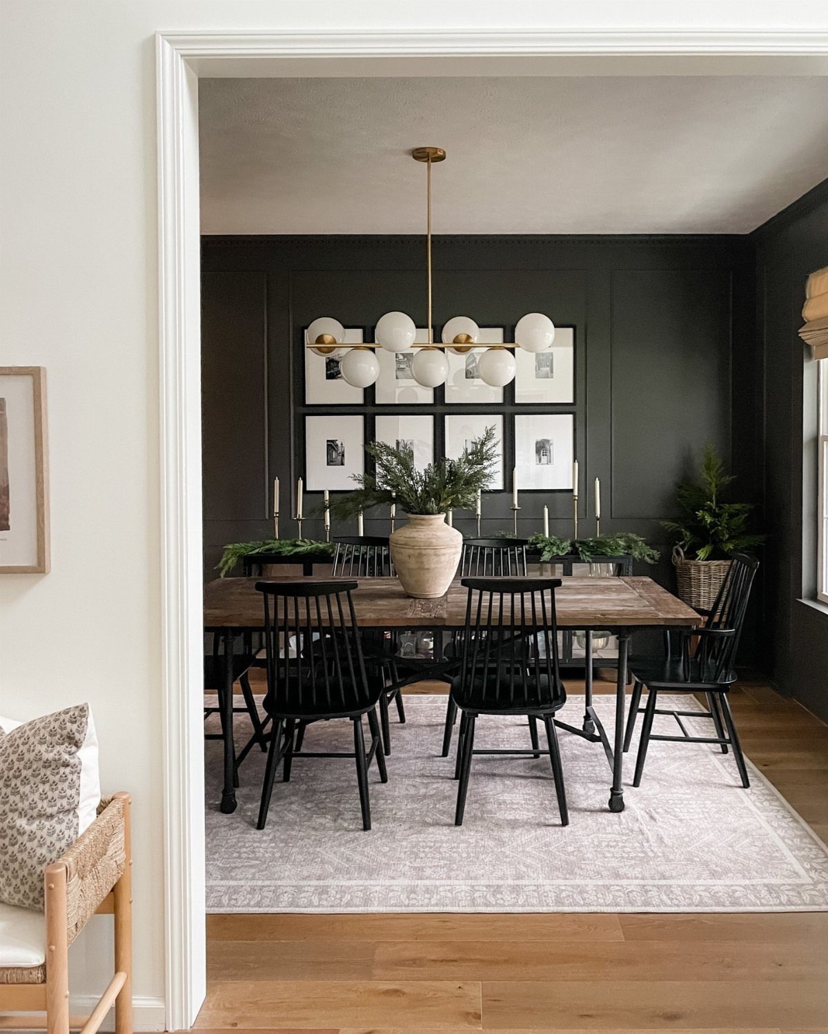
Flat trim installed in rectangular panels gives the wall architectural detail that frames whatever art you hang inside.
The molding here is painted the same dark green as the rest of the wall, so it reads as texture rather than contrast.
Cut and miter the trim yourself with a miter saw, or buy pre-cut panel kits that attach with adhesive and finish nails. Paint after installation to cover nail holes and seams.
This treatment works in rentals if you are allowed to patch nail holes when you leave, but it requires more repair than removable decor.
13. Wall Mural
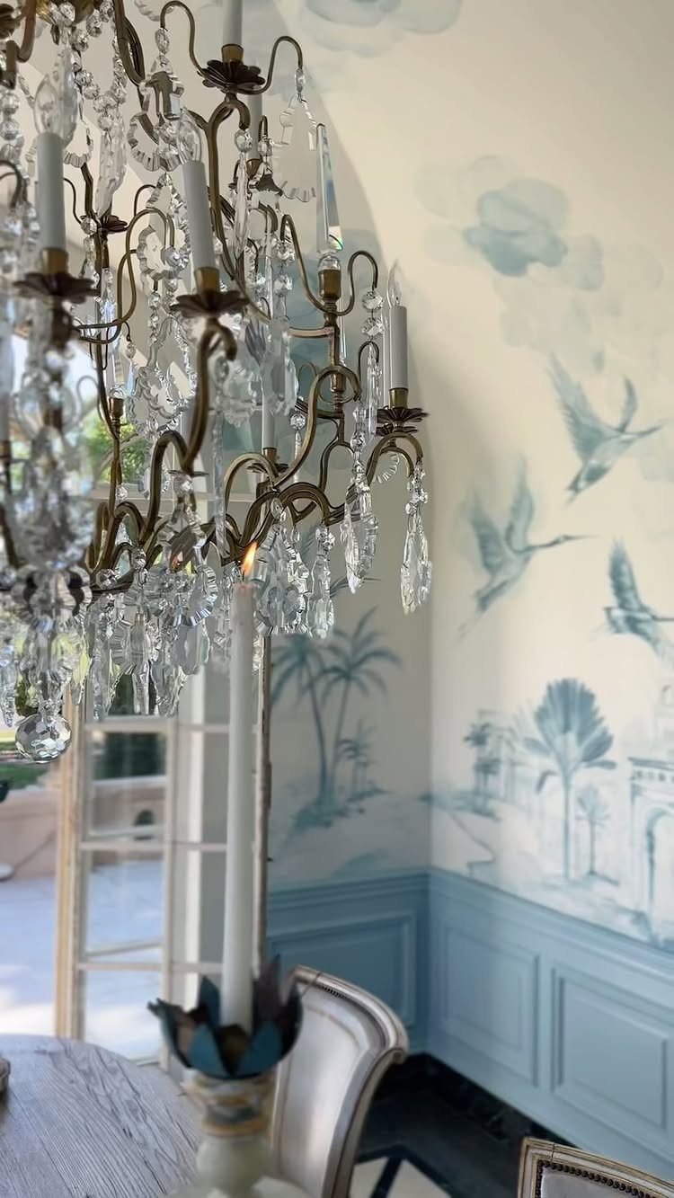
A painted landscape mural turns the wall into a scene rather than a backdrop. The blue and white palette here keeps it restful, and the birds add detail that stops short of feeling busy.
Murals come as wallpaper panels you hang like regular wallpaper, or you can hire a muralist to paint directly on the wall. The wallpaper version costs less and works in rentals if you use removable adhesive.
Pick a scene that suits the room’s formality. Landscapes and botanical scenes fit most dining rooms; busier cityscapes or abstracts can overwhelm a small space.
14. Symmetrical Grid Layout
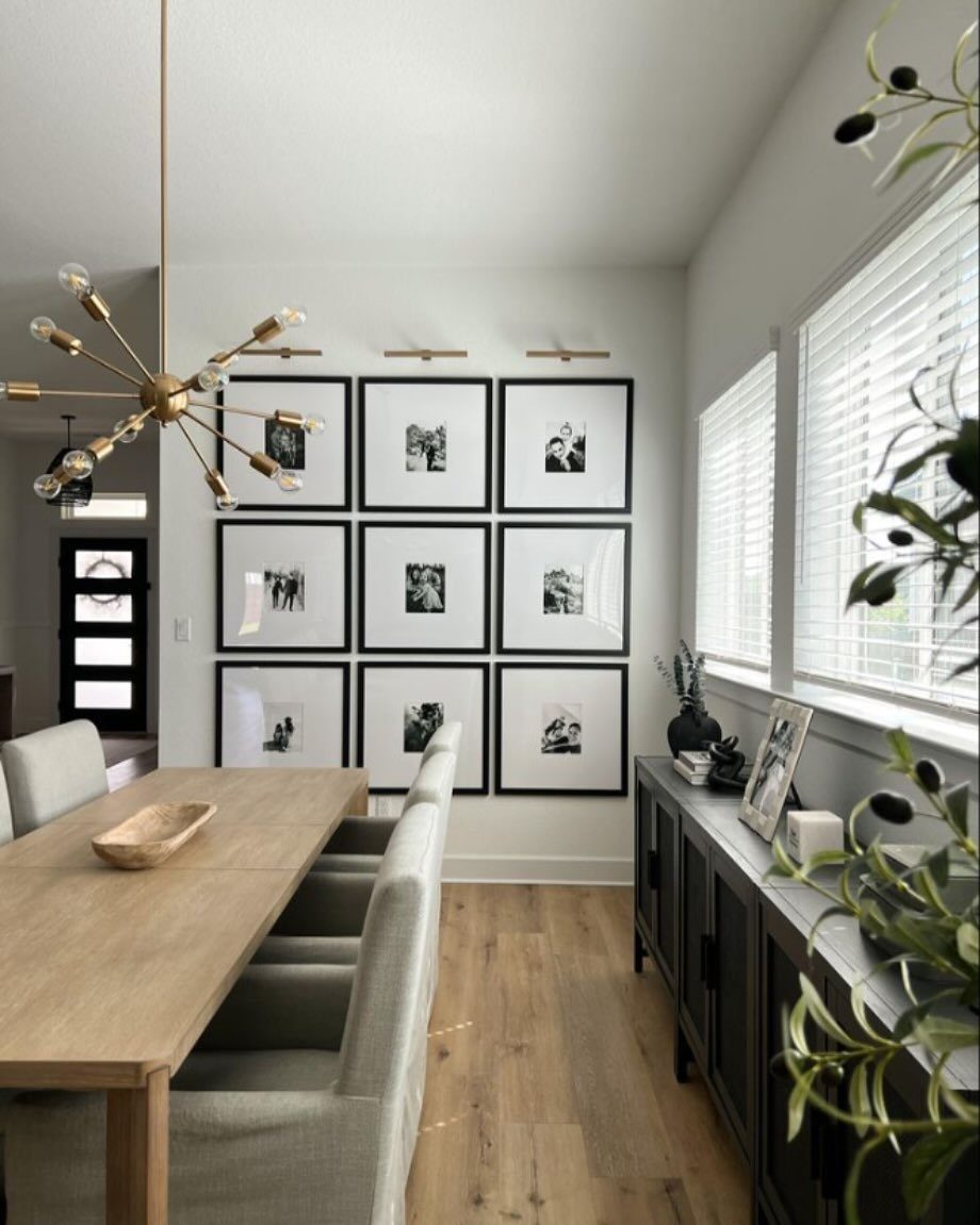
9 identical frames in a perfect grid create order on a blank wall. The even spacing and matching sizes read as intentional, and picture lights mounted above each row emphasize the formal arrangement.
Measure and mark the spacing before you hang anything. A grid falls apart if one frame sits off by an inch.
This layout works best with photos or prints that share a theme or color scheme. Mismatched subjects in identical frames can feel forced rather than cohesive.
15. Use of Color Palette
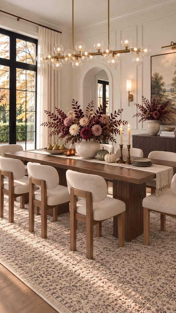
The painting pulls burgundy from the flowers and cream from the chairs, tying the wall into the rest of the room. When the art repeats colors already present, the space feels deliberate rather than decorated in pieces.
Exact matches are not necessary; the burgundy in the painting does not need to match the flowers perfectly to connect them visually.
16. Botanical Art
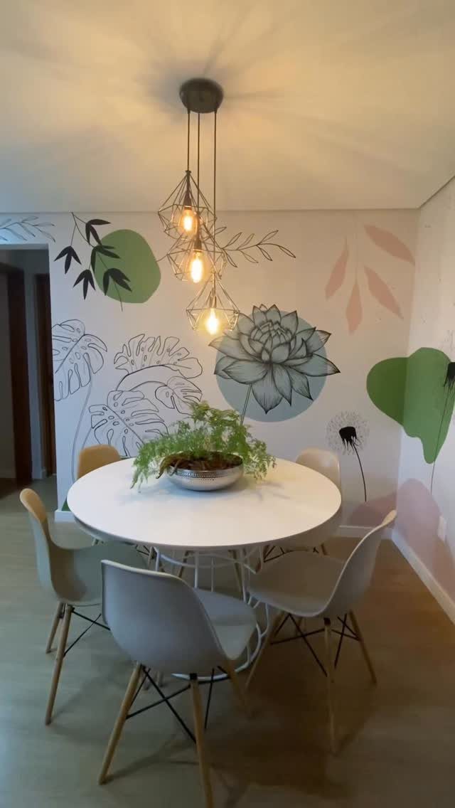
Line drawings of leaves and stems in black ink keep the wall graphic without adding much color. The large scale makes the botanicals feel architectural rather than decorative, and the simple lines work with modern furniture.
Botanical prints come framed or as peel-and-stick decals you apply directly to the wall. Decals cost less and remove cleanly, which matters in rentals.
Group several prints together if the wall is wide, or use one oversized piece to anchor a narrow space.
17. Abstract Art
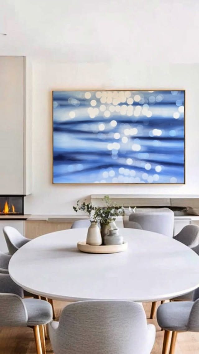
A large canvas in shades of blue brings color to the wall without depicting anything specific. The brushstrokes add texture, and the size anchors the round table below without competing with the fireplace.
Abstract pieces give you flexibility to change the room later since they are not tied to a literal subject. Pick colors that appear elsewhere in the space so the art feels connected rather than random.
Hang it low enough that the bottom edge clears the table.
18. Traditional Religious Artwork
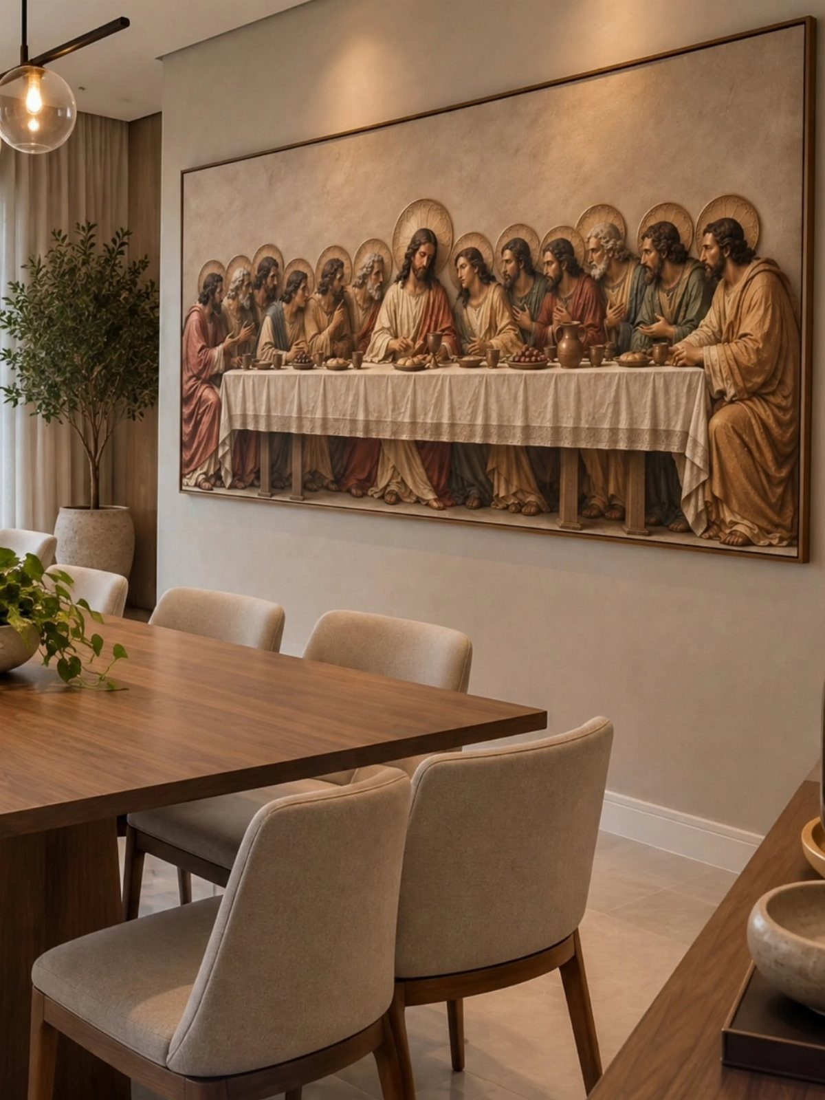
A framed reproduction of The Last Supper suits a formal dining room where the subject connects to the purpose of the space. The ornate gold frame adds weight, and the large size fills the wall above the table.
It suits a room where the rest of the furniture and decor stay simple. Heavy art needs breathing room, and layering it with other wall decor can feel cluttered.
Choose a frame that matches your furniture finish. The gold here ties into warm wood tones; a simpler black or walnut frame would suit a more contemporary space.
19. Marble Wall Panels with Sconces
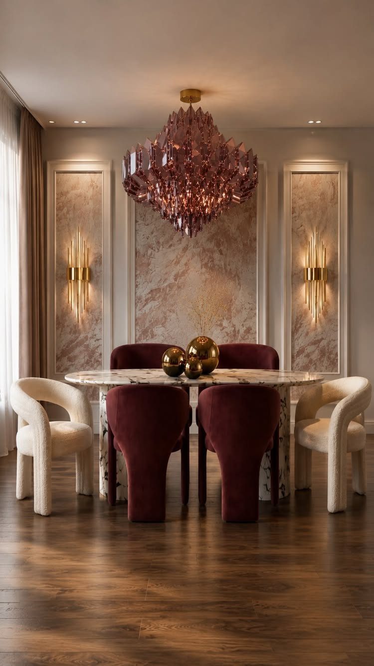
Marble panels set into the wall add luxury that paint alone cannot deliver. The veining in the stone creates natural pattern, and sconces mounted directly on the marble provide task lighting for a sideboard or buffet below.
Real marble veneer costs more than tile but installs the same way: adhesive on the back, grouted seams. Porcelain slabs printed to look like marble cost less than natural stone and hold up better in high-traffic areas.
The sconces need electrical boxes behind the marble, so plan the layout before you tile.
20. Built-in Illuminated Plant Niches
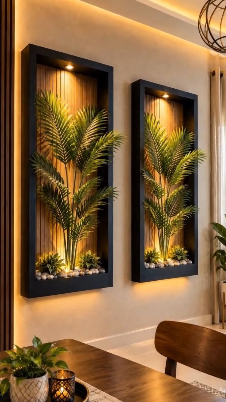
Recessed niches cut into the wall hold plants without taking floor space. The wood slat backing adds texture, and the spotlight mounted at the top keeps the greenery visible at night.
Framing a niche into drywall takes a stud bay and basic carpentry, or you can buy prefab niches that mount to the surface. Paint the interior a contrasting color or line it with slats for depth.
Use an interior wall where you control what sits behind it. Exterior walls hold insulation you do not want to cut through.
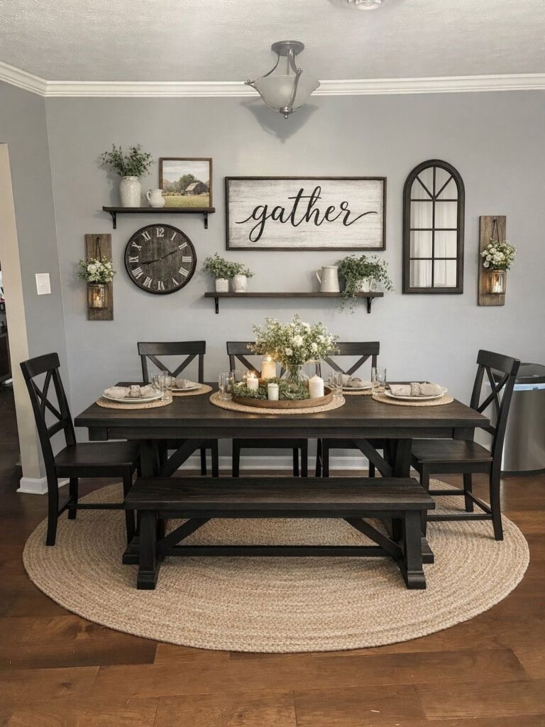
21. Floating Display Shelves
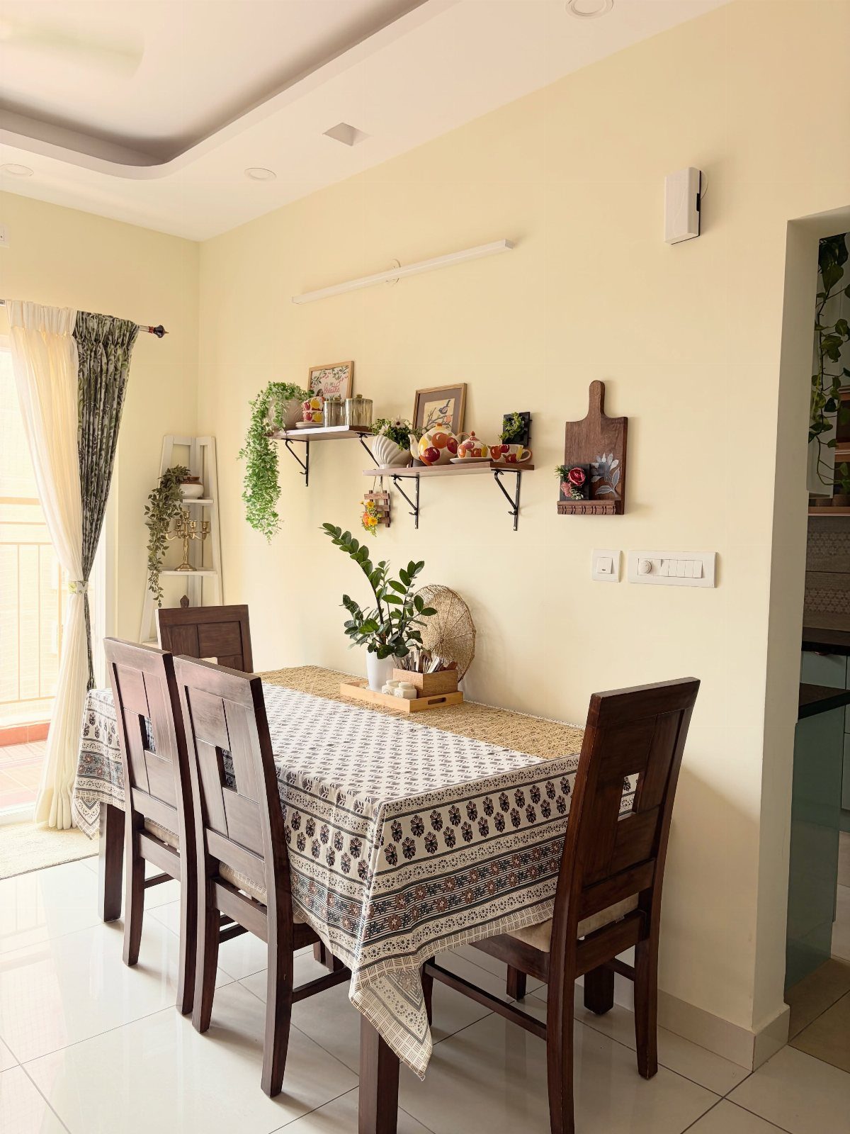
Floating shelves give you space to rotate small decor without committing to framed art. The mix includes plants, photos, and a cutting board, so the display feels collected rather than matched.
Install shelves with hidden brackets rated for the weight you plan to hold.
Keep the arrangements loose. A shelf packed edge to edge reads as clutter, not curation.
22. Modern Vertical Wall Sconces
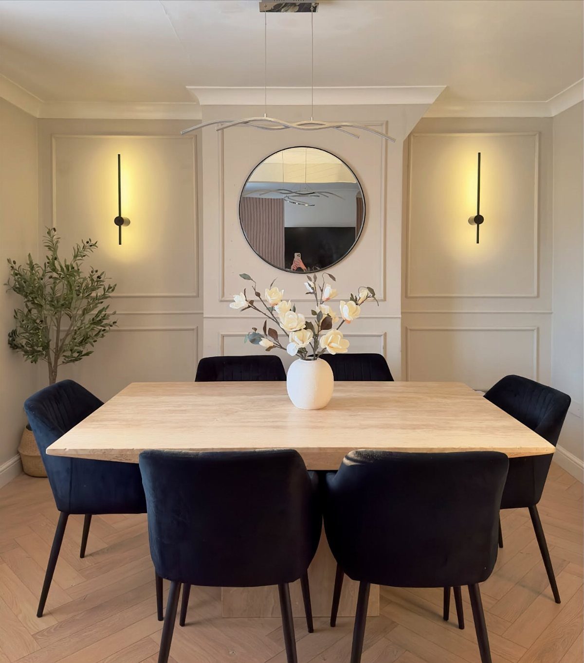
Vertical sconces on either side of a mirror bring symmetry to the wall and light the space without overhead glare. The slim profile keeps them from intruding on narrow walls, and the vertical orientation lifts the sight line.
Choose sconces with integrated LED strips for even light, or go with exposed bulbs for adjustable brightness. Hardwiring requires an electrician unless you have existing junction boxes at the right height.
This layout works best when the mirror and sconces align on center with the table.
23. Rustic Branch Lighting Feature
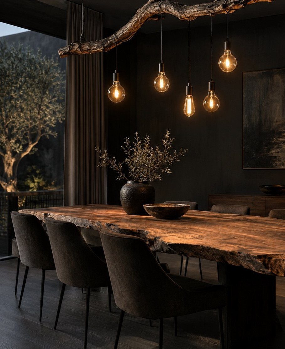
A real tree branch mounted across the wall and ceiling supports pendant lights that hang at different heights. The natural shape brings texture that manufactured fixtures cannot match, and the Edison bulbs add warm light without shades or glass.
Source a dry branch with interesting forks and sand it smooth before mounting. Attach it to wall studs and ceiling joists with heavy-duty brackets, then run pendant cord along the branch and down to an outlet or junction box.
This works in spaces with high ceilings where the lowest bulb clears heads comfortably.
24. Linear Triptych
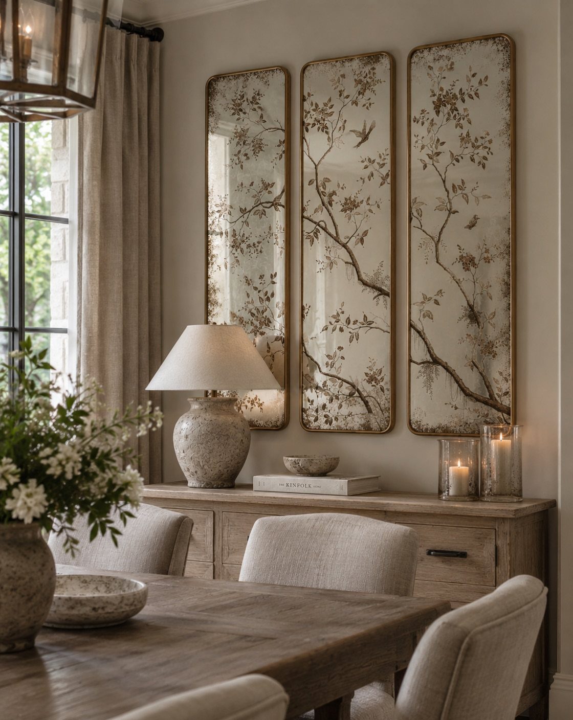
Three tall pieces hung side by side fill a wide wall with one cohesive statement. The narrow proportions and matching frames keep the arrangement structured, and the botanical detail inside the mirrored panels reflects light back into the room.
Measure the total width of all 3 pieces plus the gaps between them before you start, then mark the wall so the grouping centers on the sideboard.
This layout suits console tables and buffets where you need horizontal coverage without stacking frames vertically.
25. Chalkboard Wall
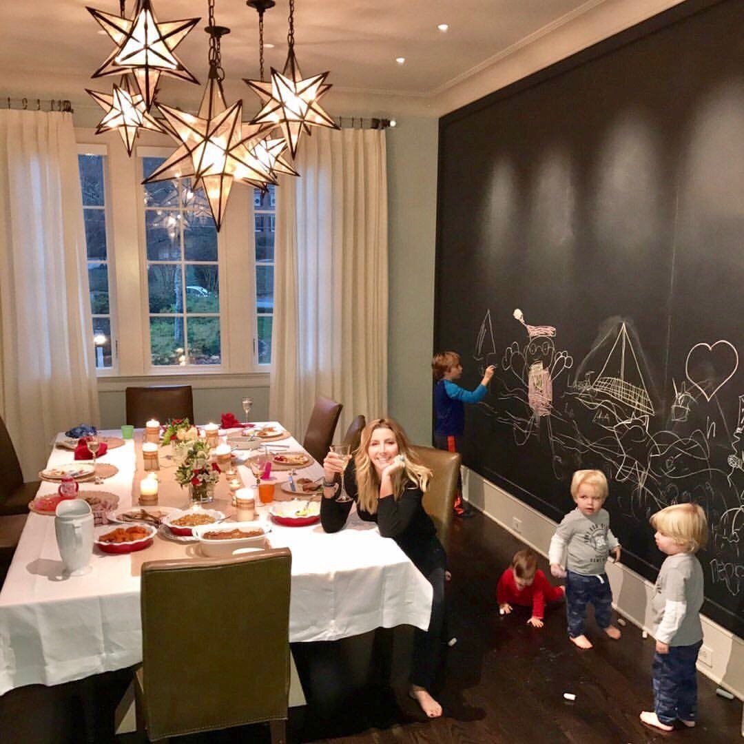
Chalkboard paint turns the full wall into a surface for drawings, menus, or notes that change as often as you need them to. The writing wipes off with a damp cloth, and kids can draw without worrying about permanent marks.
Apply chalkboard paint over primed drywall with a roller, then condition the surface by rubbing the side of a piece of chalk over the entire area and erasing it.
I’d put this in casual dining rooms where the space already leans playful rather than formal.
Choosing the Right Size and Layout
Size your wall decor to the furniture sitting below it. Art or a grouping should span 60–80% of the width of a sideboard or buffet, so a 60-inch sideboard calls for 36–48 inches of coverage.
Rooms with ceilings above 9 feet can go a few inches higher.
If you are hanging a grid, keep the spacing between frames tight—1.5–3 inches depending on the overall size. Wider gaps make each piece read separately instead of as one statement.
Leave 2–4 inches of clearance between the top of a sideboard and the bottom of the art. Cutting the paper to size and taping it to the wall before you commit to nails saves you from rehang regret.
Creating a Cohesive Look
Pick 2 materials or finishes and let them show up on the wall and somewhere else in the room.
If your chair legs are black, match the frames. If your flatware is brass, echo it in the sconces.
Pull colors from what you already have rather than introducing new ones.
Keeping the repeated elements consistent across the wall, the furniture, and the lighting makes the room feel finished rather than decorated in stages.
Lighting Considerations
Put mirrors across from windows or under chandeliers so they bounce the light back. The effect doubles the brightness without adding fixtures, and it makes the room feel larger.
When the mirror anchors the wall, give it more surface area than anything hung beside it. A clear hierarchy keeps the wall from reading as busy.
Layer your lighting instead of relying on overhead alone.
Sconces add depth, and candles bring warmth that makes food and faces look better. Bulbs between 2700 and 3000 Kelvin give you a cozy, flattering glow.
Dim the lights at dinner. Overhead brightness flattens the room, while lower light pulls focus to the table and softens shadows.
Frequently Asked Questions
How to style a long dining room wall?
A panoramic print or horizontal triptych fills the length without breaking up the wall into smaller pieces.
Gallery walls work too if you arrange frames in a single horizontal band rather than stacking them vertically. Match the wall’s proportions so the art looks like it belongs there.
What can I put on my walls to decorate?
Art, mirrors, wallpaper, wood panels, decorative plates, floating shelves, or wall sconces all work depending on the look you want. Pick one or two treatments per wall so the space reads as intentional rather than busy.