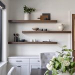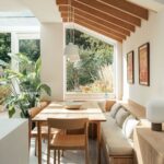
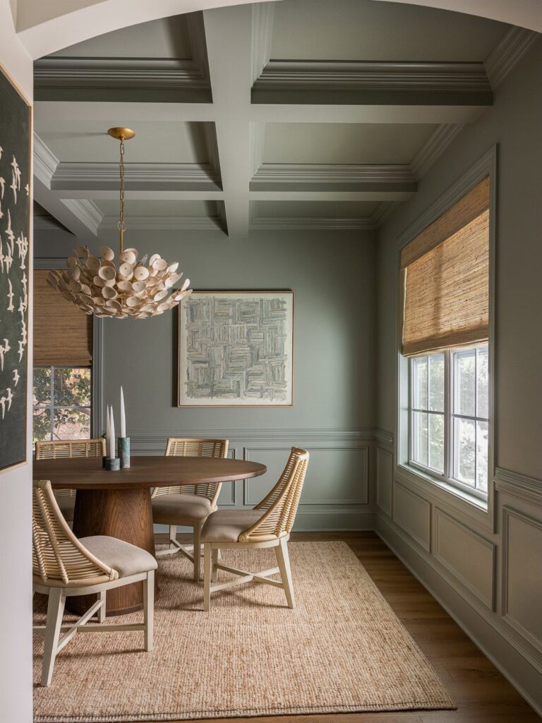
The 10 colors here range from pale celery to chocolate brown, with advice on pairing them and using them in your space.
If your dining room already has warm wood furniture or brass hardware, the greens and neutrals pair without needing new pieces, while the deeper tones like terracotta and moody blue come in through paint or upholstery.
The pairing advice covers which accent colors layer with mustard and moody blue and how to ground faded pastels with neutrals.
1. Webster Green
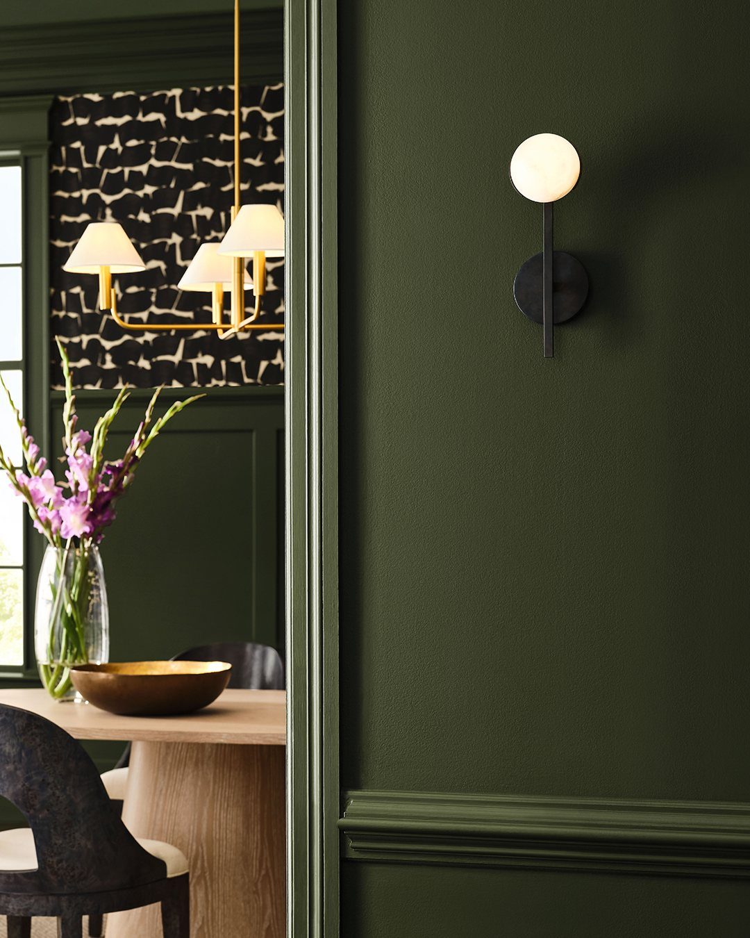
Webster Green sits between forest and emerald, dark enough to hold its own but not so deep it needs bright light to read.
It works in dining rooms that get good natural light and in ones that rely on fixtures after dark, which makes it more flexible than the deeper jewel tones.
The look pairs with warm wood tones and brass or gold hardware. If the room has existing oak or walnut furniture, this green pulls it together without demanding new pieces.
One coat over primer usually covers well, though older walls with texture may need two.
2. Mustard Yellow
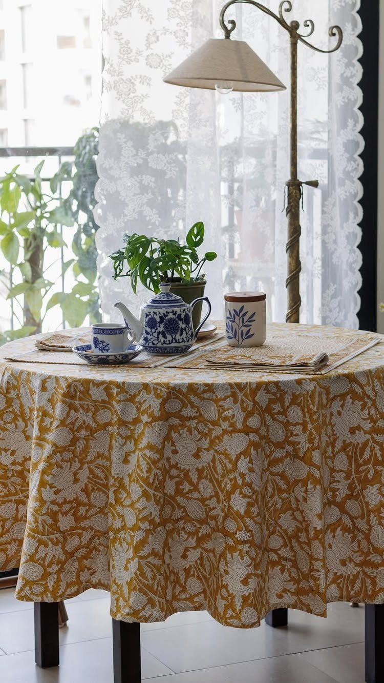
Mustard yellow brings warmth without the brightness of lemon or the pastel softness of butter. It reads as golden rather than primary, which keeps it from feeling juvenile in a dining space.
A floral print in fabric gives you an easy trial before committing to walls. A tablecloth, runner, or seat cushions let you test the tone against your existing furniture and lighting.
Mustard pairs well with navy, charcoal, or cream. It also works with natural wood finishes and white dishes, so most dining setups can absorb it without a full refresh.
3. Faded Pastels
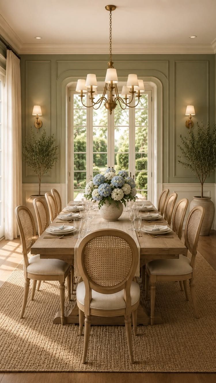
Faded pastels look like the paint has been on the wall for years, which gives a room an established feeling even if you just moved in.
Dusty pink and pale blue both fit this family, and the common thread is low saturation.
The look lands better when the furniture and fixtures stay light. Dark wood or black metal can overpower the softness, though brass and gold hold their own without competing.
If you are painting, start with a mid-tone base and add white to bring it down to the faded level you want. 2 coats usually cover.
4. Nature-Inspired Neutrals
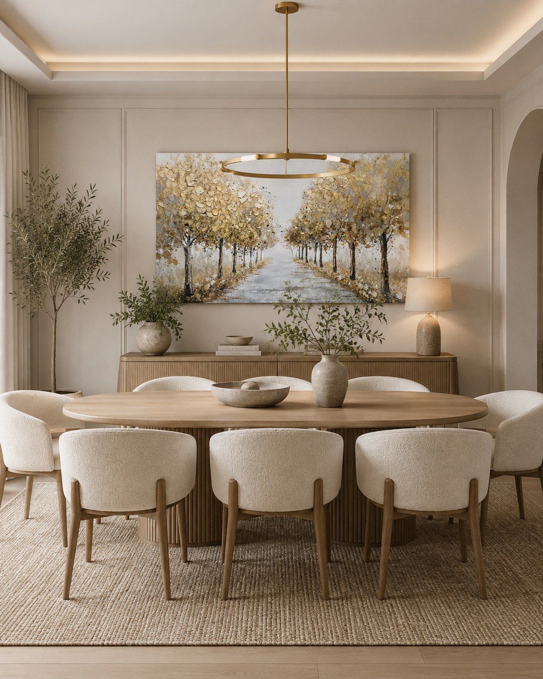
Clay, along with taupe, beige, and warm gray, anchors a dining room without reading as stark white or leaning into color. The tone is closer to sand than concrete, which keeps the space feeling warmed rather than cooled.
These neutrals work in rooms with strong artwork or rugs, since they step back and let those pieces carry the visual weight.
If your dining room opens into a kitchen or living area, a neutral wall bridges the transition without needing to match exactly.
The palette pairs with almost any wood finish and metal. Cream upholstery, linen, and natural fiber rugs all fall in line.
5. Celery
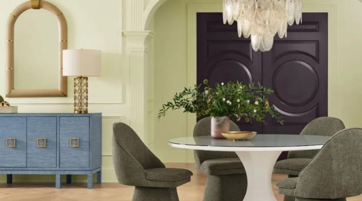
Celery is pale green with enough yellow in it to feel warm rather than cool, which separates it from mint or seafoam. It reads as soft but not pastel, and it works in rooms that get morning or east-facing light.
The tone pairs well with white trim, gray upholstery, and dark accent colors like purple. It also holds up next to brass, gold, or black hardware without clashing.
If you are painting, start with a warm white base and add green and yellow in small amounts. Test it on a sample board first, since celery can shift toward chartreuse under bright bulbs.
When selecting the 2027 Color of the Year, the trend forecasters at Sherwin-Williams remembered that there’s no reward without risk. Their selection for the Sherwin-Williams and HGTV Home by Sherwin-Williams Color of the Year is Celery, a light green with a slight yellow undertone.
6. Grounded
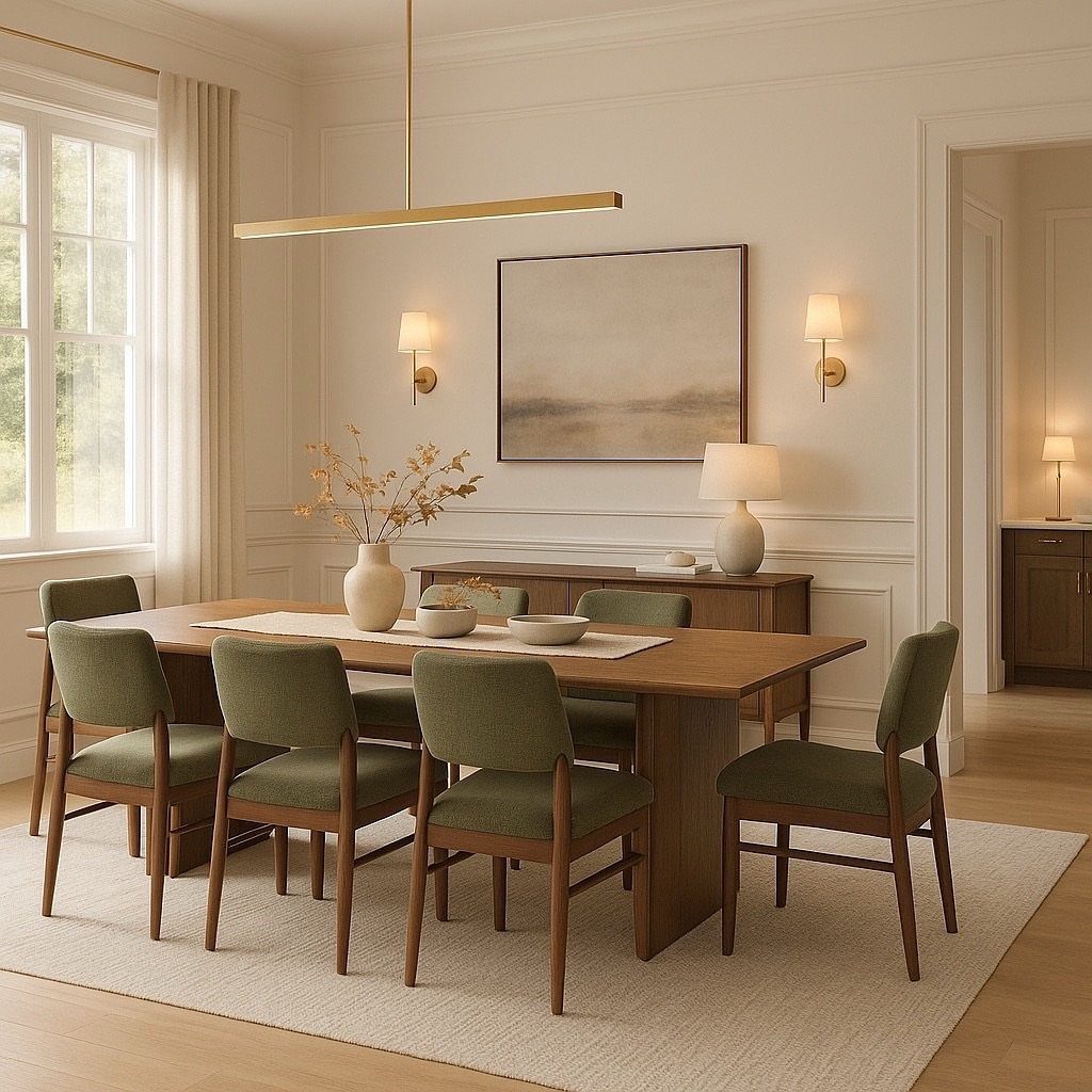
Grounded is olive green with enough brown in it to feel earthy rather than bright. It works as an upholstery color or a wall tone, and chairs bring it in without covering the whole room.
The color pairs well with wood tables, neutral walls, and gold or brass lighting. It also sits comfortably next to other greens, so if you already have sage or forest tones in the space, this one layers in without clashing.
Olive upholstery fabric is widely available in linen, velvet, and performance weaves. Reupholstering lets you bring the color in through fabric rather than paint.
7. Deep Rooted
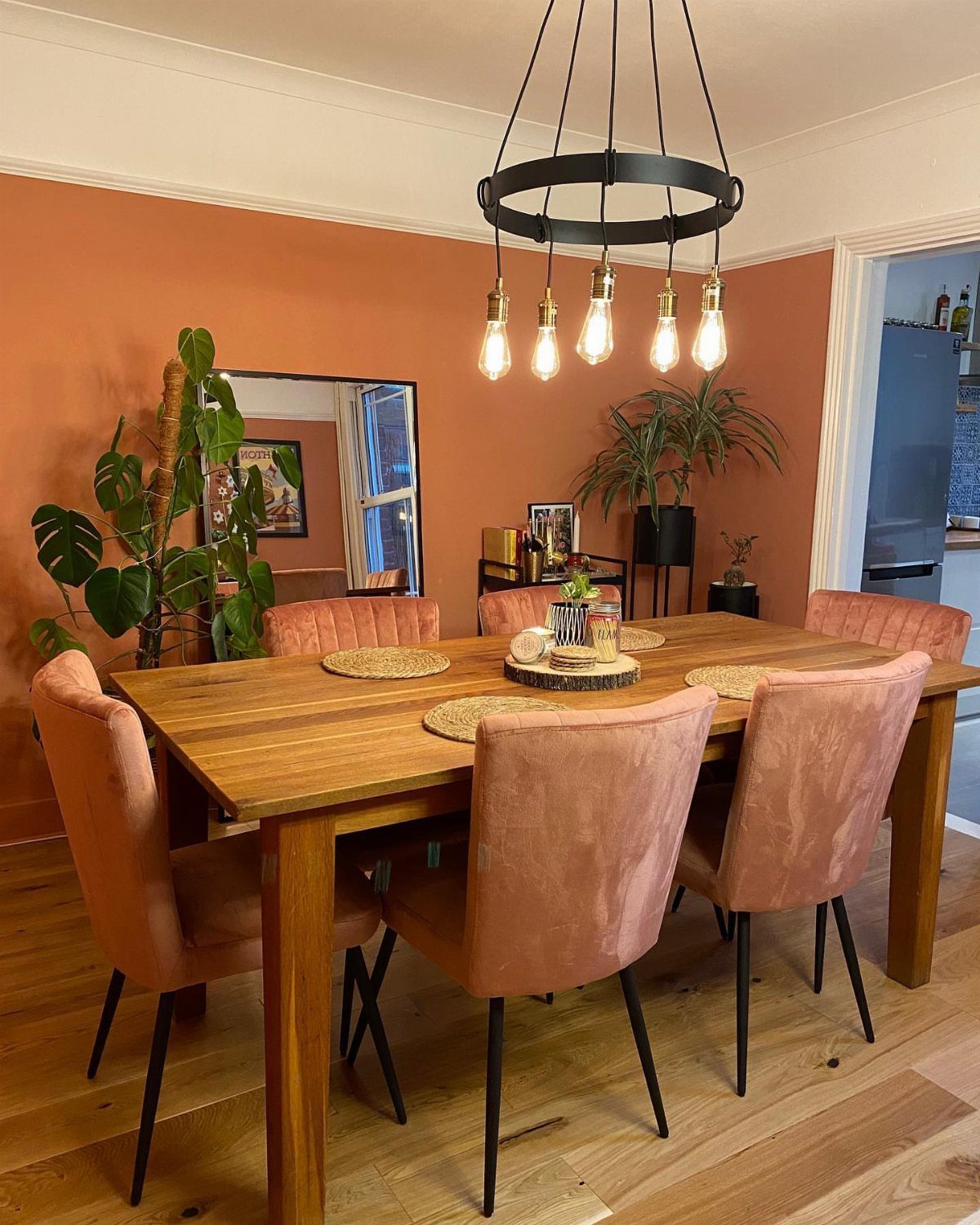
Deep Rooted brings terracotta into the dining room as a wall color rather than an accent. The tone is orange with enough brown in it to feel grounded, and it works in rooms with natural light or warm fixtures.
8. Mauve Cabinetry
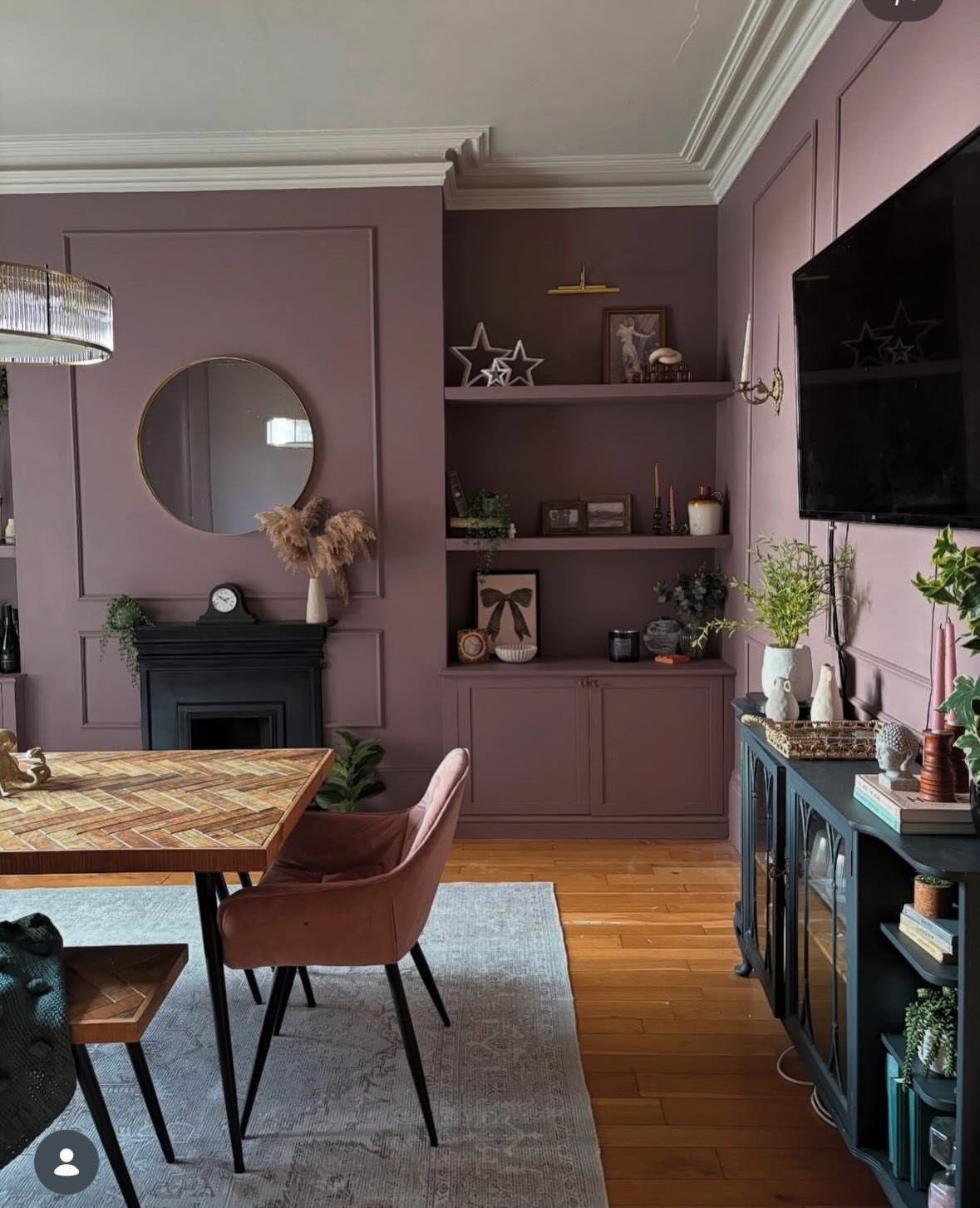
Mauve reads as dusty purple with enough gray to feel sophisticated rather than sweet. It works as a wall color or on built-in cabinetry, and the latter brings it in without covering every surface.
Mauve cabinetry also sits comfortably next to neutral walls, so if the room opens into another space, the transition stays smooth.
Painting cabinetry takes more prep than walls. Clean, sand, prime, and apply 2 coats for even coverage.
9. Rich Chocolate Brown Walls
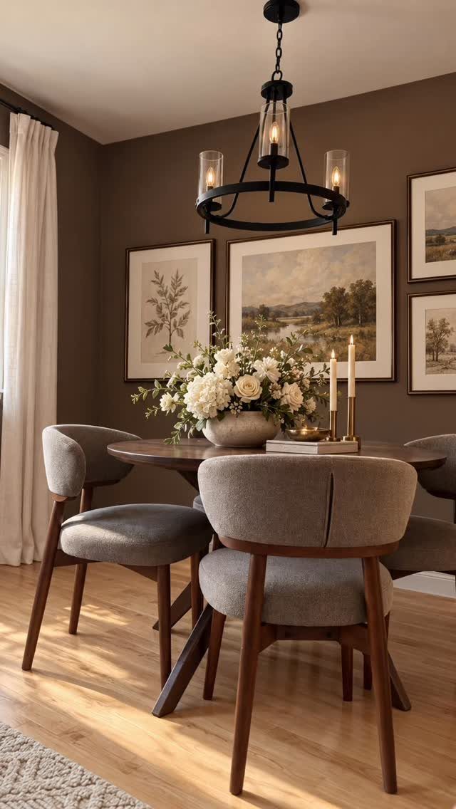
Chocolate brown walls anchor a dining room without reading as black. The tone is deep enough to feel moody but warm enough to work with wood furniture and brass lighting.
Gray upholstery balances the darkness without adding competing color. White trim, cream rugs, and light art also help lift the space.
10. Moody Dark Blue Accents
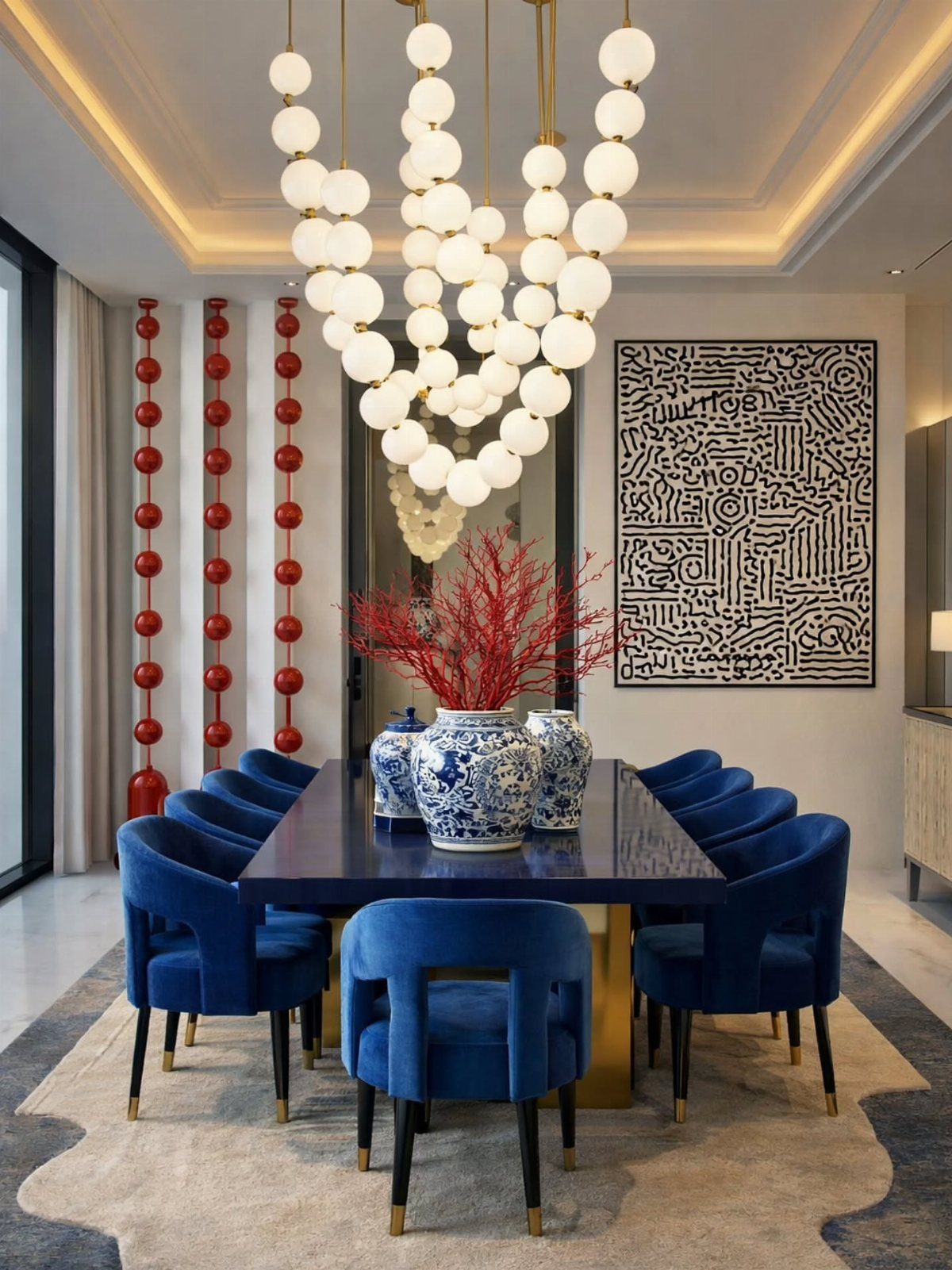
A dark blue table and matching velvet chairs bring the color in through furniture rather than walls. The pieces hold their own against white walls, and the contrast keeps the room from feeling heavy.
Performance fabric resists stains and wears better in rooms with kids or pets.
Red and white accents add warmth without clashing.
Color Pairing Advice
Pair greens with warm whites, creamy neutrals, and natural wood tones for a cohesive look. The combination grounds the color without making the room feel cold, and it leaves space for the green to carry the visual weight.
A bright red next to light greens like celery adds unexpected energy, though blue stays the safer pick if you want something that feels established. Both options work because they hold their own without competing for attention.
Darker greens, the kind that read dusty rather than bright, layer well with citron or neon yellow for a bolder look. The contrast feels modern and intentional, especially when one color covers more surface area than the other.
Trends in Dining Room Design
Browns, rusts, ambers, and burnished earthy oranges anchor the shift away from cool gray minimalism.
Color Usage Tips
The contrast also helps the eye read the space without feeling overwhelmed.
Hang the swatch where you plan to paint and check it at different times of day.
Frequently Asked Questions
What colors will be trending in 2027?
Greens dominate, from pale celery and dusty olive to deep forest tones like Webster Green.
Faded pastels in sage, dusty pink, and pale blue bring softness, while earthy tones like clay, terracotta, and chocolate brown anchor spaces with warmth. Mustard yellow and mauve add color without leaning bright or juvenile.
What are the interior trends for 2027?
Warmer, more livable colors replace cool gray minimalism.
Browns, rusts, ambers, and earthy oranges ground the shift, while muted greens and faded pastels bring softness without feeling sterile. The move favors rooms that feel lived in rather than staged for a photo.
What are the dining room color trends for 2026?
Earthier greens like moss and olive led the direction, along with chocolate browns and muted wine reds.
Mustard and goldenrod pulled yellow into richer, bolder territory after years of pale butter tones. Tonal color drenching, using closely related shades across walls and ceilings, became the treatment of choice.