Dark blue in a dining room works through paint, paneling or velvet upholstery, and the choice comes down to how much natural light the room gets.
Paint the walls, or add paneling, or let blue velvet chairs and accents carry the color while the walls stay light. Either way, warm lighting at 2700K or lower keeps the blue inviting after dark.
1. Dark Blue Paint
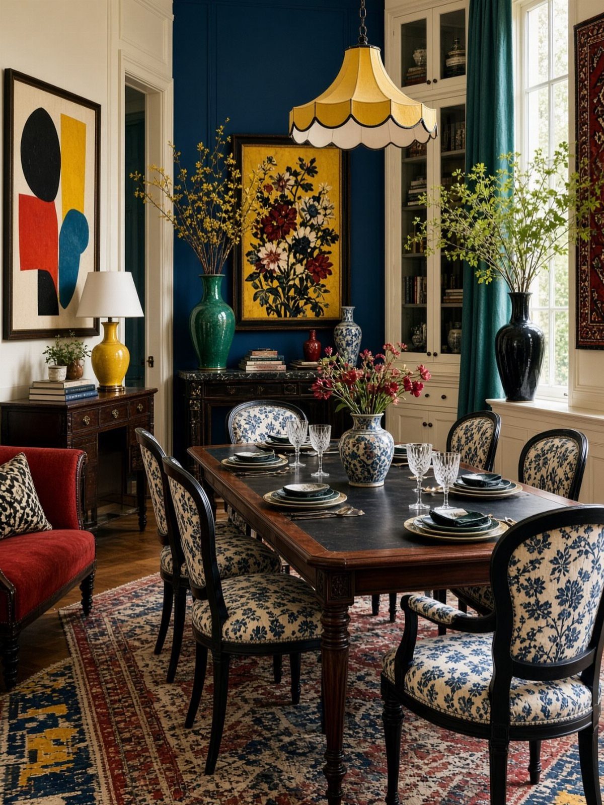
Dark blue on the walls gives a dining room instant weight and drama, the kind of saturated backdrop that makes every other color in the room read sharper.
I like how the yellow pendant light here glows against the blue without fighting it, and how the wood table and patterned chairs feel grounded instead of floating.
If you’re painting, use a primer first. Dark blues show every brushstroke and roller mark if the base coat isn’t even, and 2 finish coats will still read thin over bare drywall.
Add some drama to your dining room with dark blue. These shades look especially beautiful in candlelight, creating an elegant, luxurious setting for special occasions.
2. Brass and Glass Chandeliers
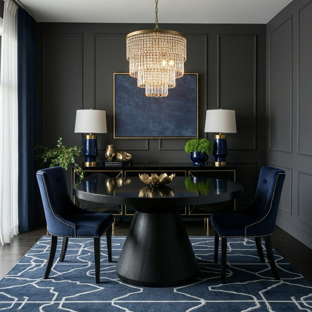
A tiered brass and glass chandelier catches light at every level, and in a dark blue room that refraction matters.
The glass breaks up the fixture’s visual weight so it doesn’t feel like a solid mass overhead, and the brass reads warm without turning the whole room gold.
Look for one with clear or lightly smoked glass rather than heavily tinted crystal. The clearer the glass, the more light it throws back into the space, and dark walls already absorb enough.
3. Furniture Choices
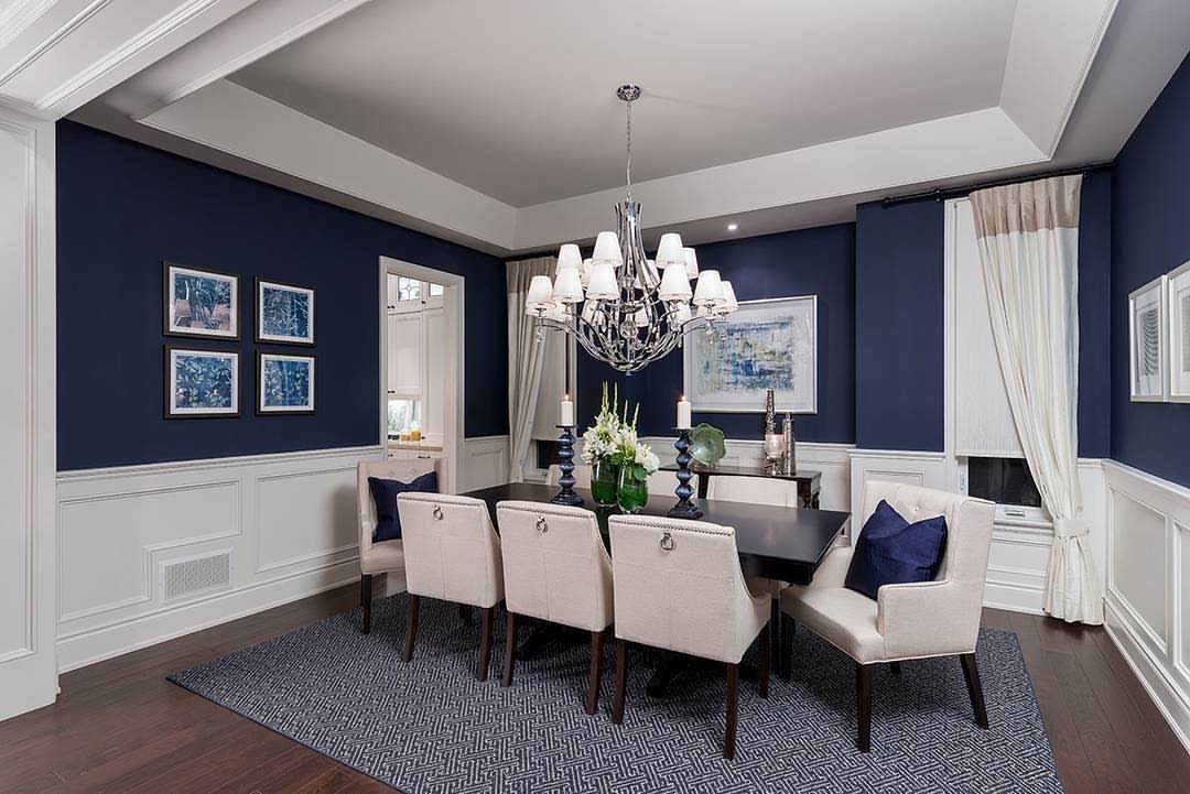
Light furniture against dark walls gives you contrast where you actually sit. Cream upholstered chairs against a dark wood table stop the blue from taking over, so you can keep the wall color as bold as you want.
Go for upholstery in an off-white or pale neutral rather than bright white.
Pure white can look stark next to a deep color, but something with a hint of warmth, like linen or natural canvas, softens the edge without losing the contrast.
4. Color Drenching Technique
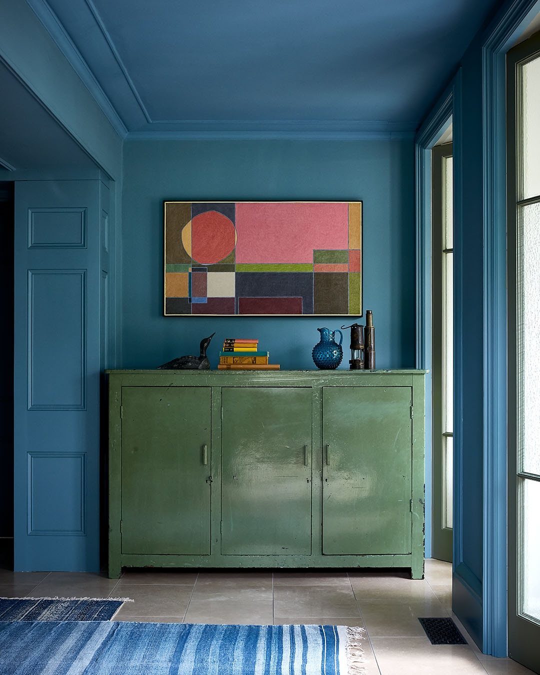
Color drenching means painting the walls, ceiling, and trim all the same shade.
It erases the usual boundaries in a room and makes the space feel bigger and more enveloping at the same time, especially in a bold color like this blue.
Use a satin or eggshell finish on the walls and ceiling, and semi-gloss on the trim. The slight sheen difference keeps trim from disappearing into the wall even when the color is identical, and you’ll still see the molding profiles.
5. Dark Blue Paneled Walls
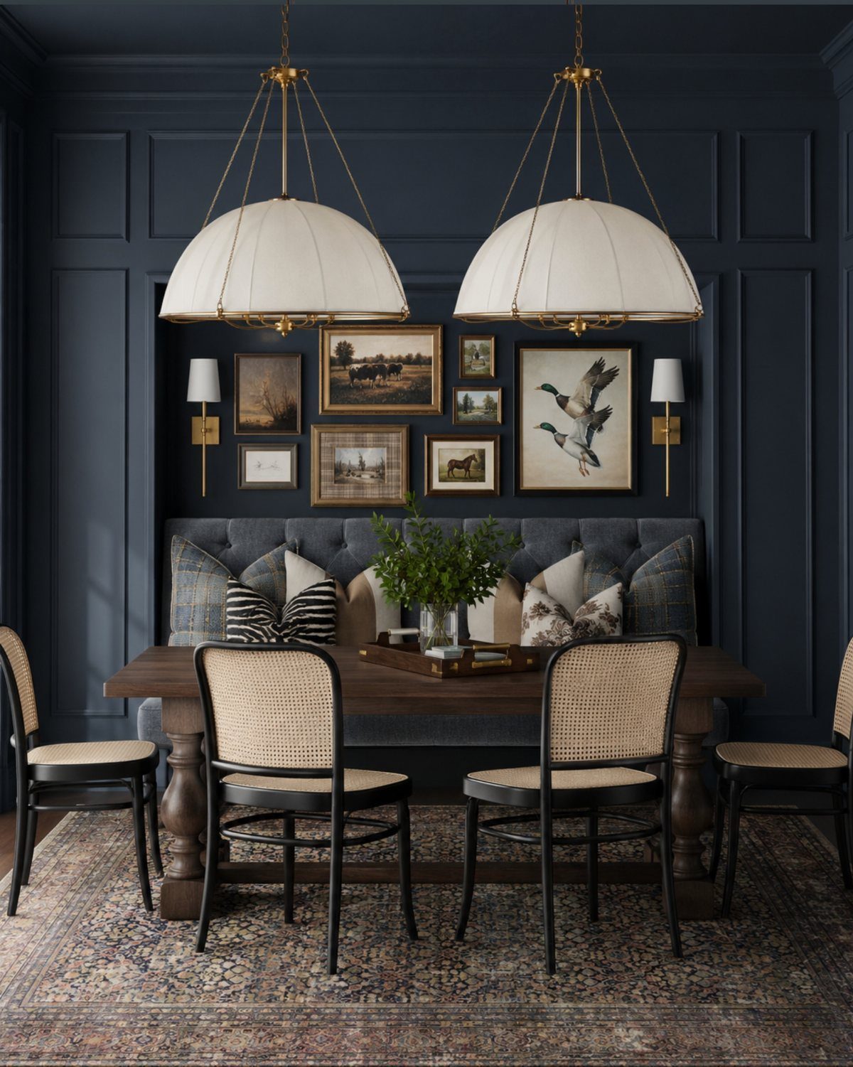
Paneling in dark blue adds texture the flat paint version can’t give you. The lines between panels create shadow and rhythm across the wall, and the white dome pendants here read crisp and sculptural against the deep color.
Board-and-batten or simple vertical paneling works well in a dining room.
Install it three-quarters of the way up the wall or all the way to the ceiling, then paint it the same blue as the field. The millwork holds its shape even in a saturated color.
6. Blue Velvet Furniture and Accents
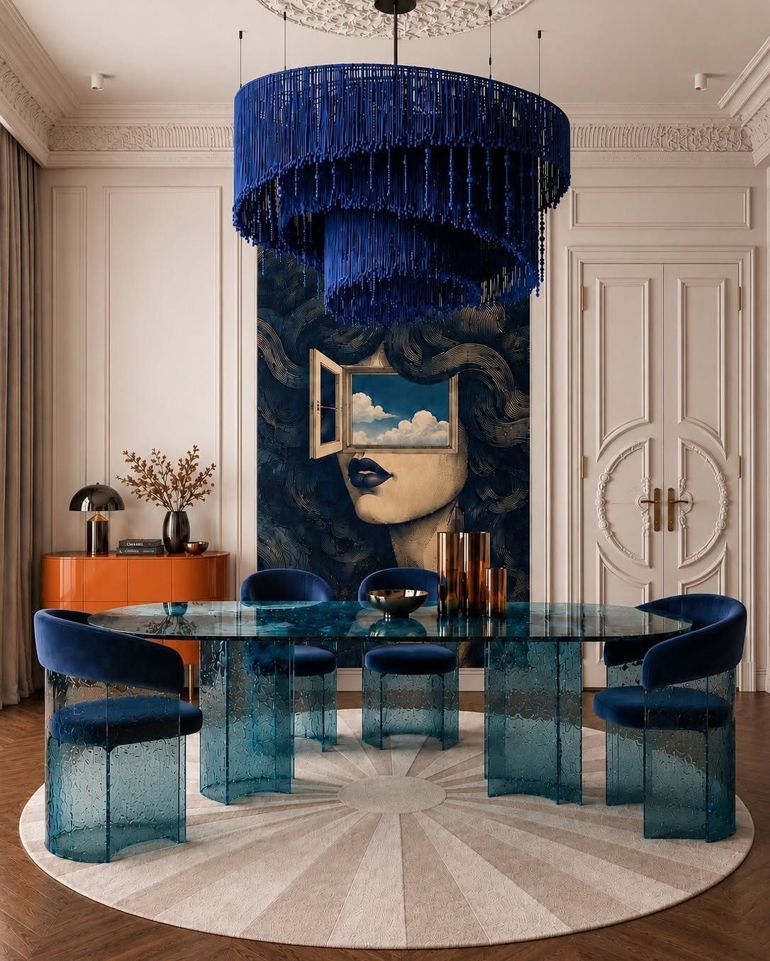
Blue velvet brings the color into the room through furniture rather than paint, which gives you flexibility if the walls stay neutral.
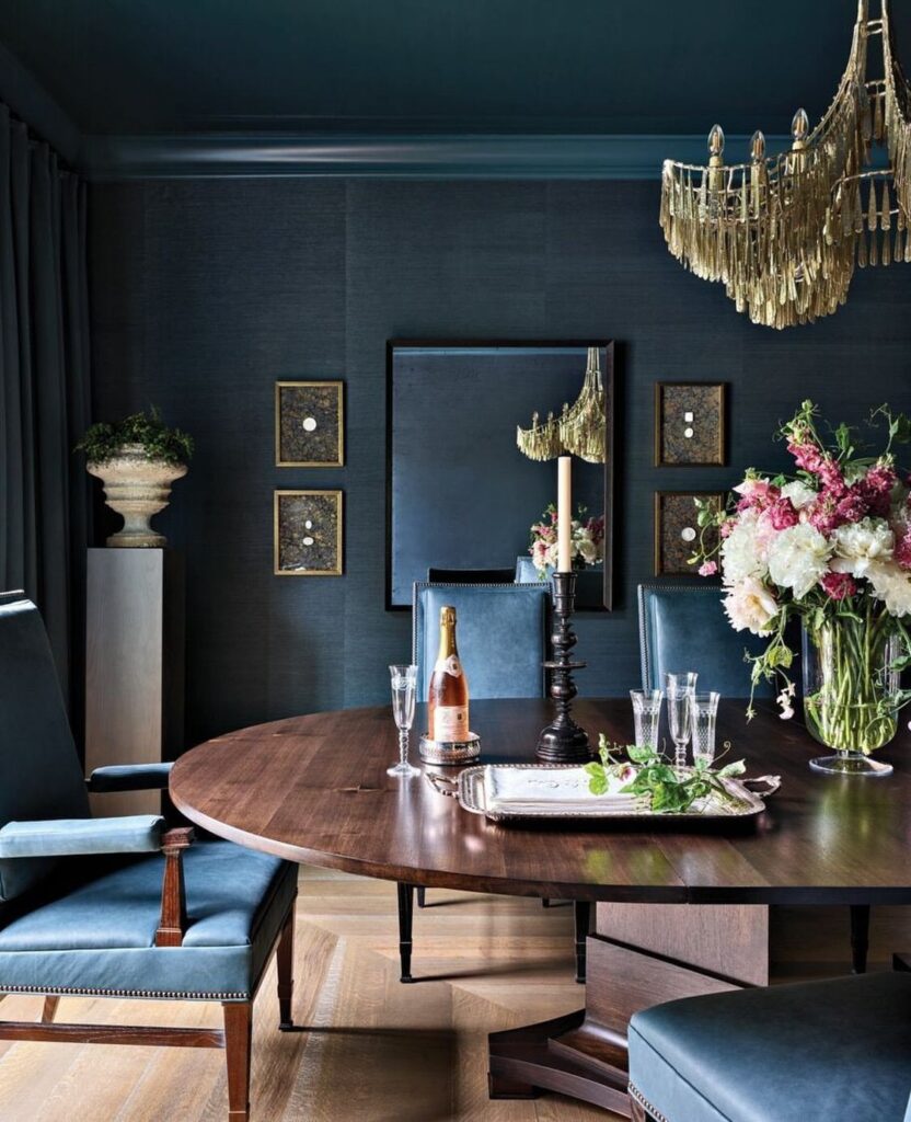
The velvet texture catches light differently than matte fabric, so the chairs read richer and the fringed chandelier overhead doubles down on softness and movement.
Look for velvet with a dense pile.
Thin velvet crushes and shows wear quickly, especially on dining chairs. A heavier weave holds its color and texture longer, and spot-cleans better when something spills.
Creating a Cozy Atmosphere
The saturated tone absorbs light instead of bouncing it around, which makes the space feel quieter and more contained, the kind of setting where a long dinner doesn’t feel rushed.
Layer in warm lighting to keep the mood inviting rather than closed off.
Table lamps on a sideboard or a dimmer on the overhead fixture let you adjust the brightness as daylight fades, and warmer bulbs (2700K or lower) soften the blue without washing it out.
Texture helps too. A linen tablecloth, woven placemats, or upholstered seat cushions add tactile warmth that balances the visual weight of the walls, so the room feels grounded without feeling heavy.
Choosing the Right Shade
The amount of natural light changes how dark blue reads on the wall.
A room with large windows can carry a deep navy or slate without feeling dim, but a dining room with limited daylight or windows facing a covered porch will show the same color several shades darker.
Test a sample on the wall and check it at different times of day before committing to a full room.
Paint a 2-foot square in a corner that gets typical light for the space, then look at it in morning light, afternoon, and after dark with your fixture on.
The color will shift, and you’ll see which version you’re actually living with.
If the room is naturally dark and you still want a bold blue, go one or two shades lighter than the swatch you first pulled. The reduced daylight will deepen it once it’s up.
Frequently Asked Questions
Is blue a good color for a dining room?
Blue works well in a dining room because it creates a sophisticated, relaxed atmosphere that feels right for long meals and conversation.
The color pulls visual weight inward instead of reflecting it back, which gives the room a settled feeling that works for long meals.
What colors go with a dark blue room?
Warm metals like brass and gold complement dark blue without competing with it, and off-white or cream upholstery gives you contrast where you sit.
Natural wood reads warmer next to the cool wall color, and bulbs below 2700K keep the space from feeling cold or gray.