A painted ceiling separates the dining zone overhead when you can’t touch the walls or add furniture to divide the room.
A rug that holds all four chair legs when pulled out marks the dining area fastest, or a bistro table takes under 3 feet when a full set won’t fit.
1. Define with a Rug
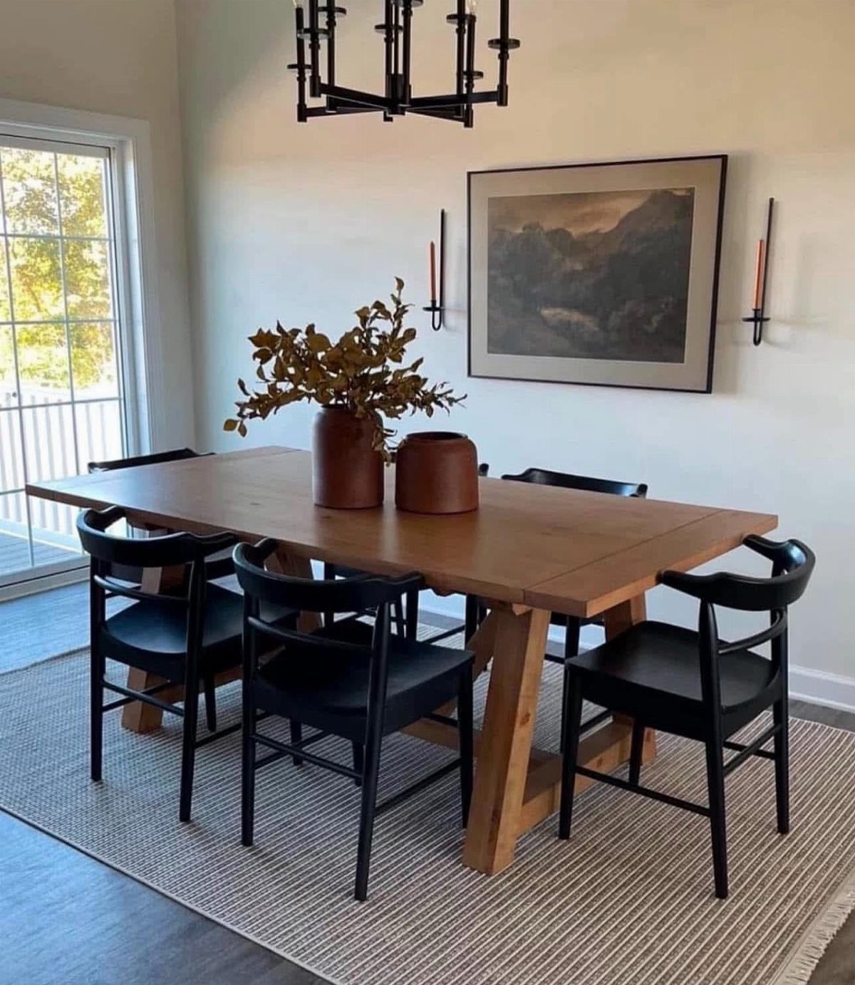
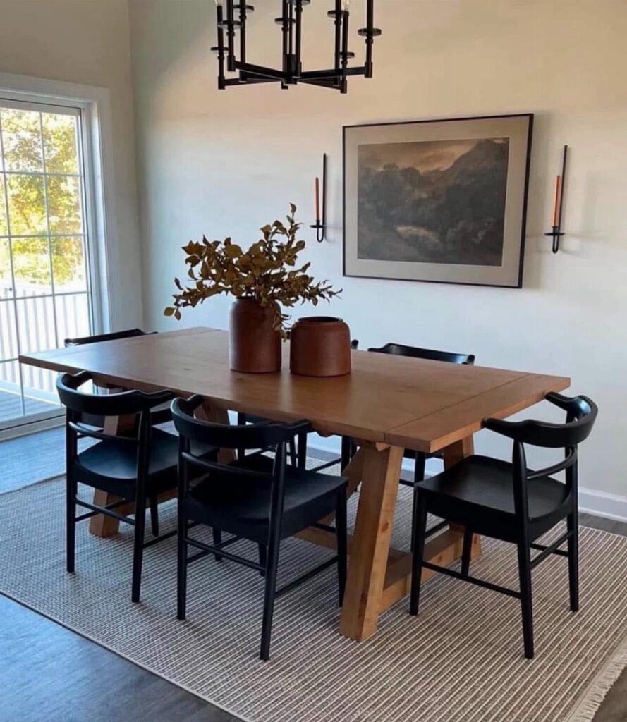
A rug creates a visual boundary for the dining area when it shares space with the living room. The edge of the rug marks where one zone ends and the next begins, no walls required.
Size the rug so all chair legs stay on it when you pull the chairs out to sit. Striped or bordered patterns read as stronger dividers than solid colors, though either works if the size is right.
This is the simplest fix when the furniture alone doesn’t separate the 2 spaces clearly.
2. Bold Light Fixtures
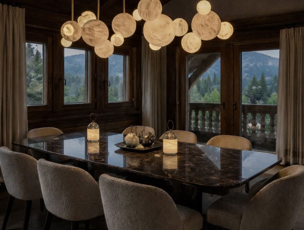
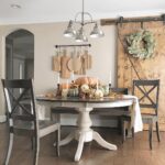
A sculptural light fixture anchors the dining table and pulls attention upward without claiming any floor space. The fixture becomes the room’s focal point, especially in open layouts where the table might otherwise disappear into the living area.
Hang it low enough to light the table well but high enough that seated diners can see one another. Scale matters: a fixture should be about half to two-thirds the width of the table beneath it.
Clustered orbs, geometric cages and branching designs all work. Pick one with enough presence that it holds attention from the sofa.
3. Mismatched Seating
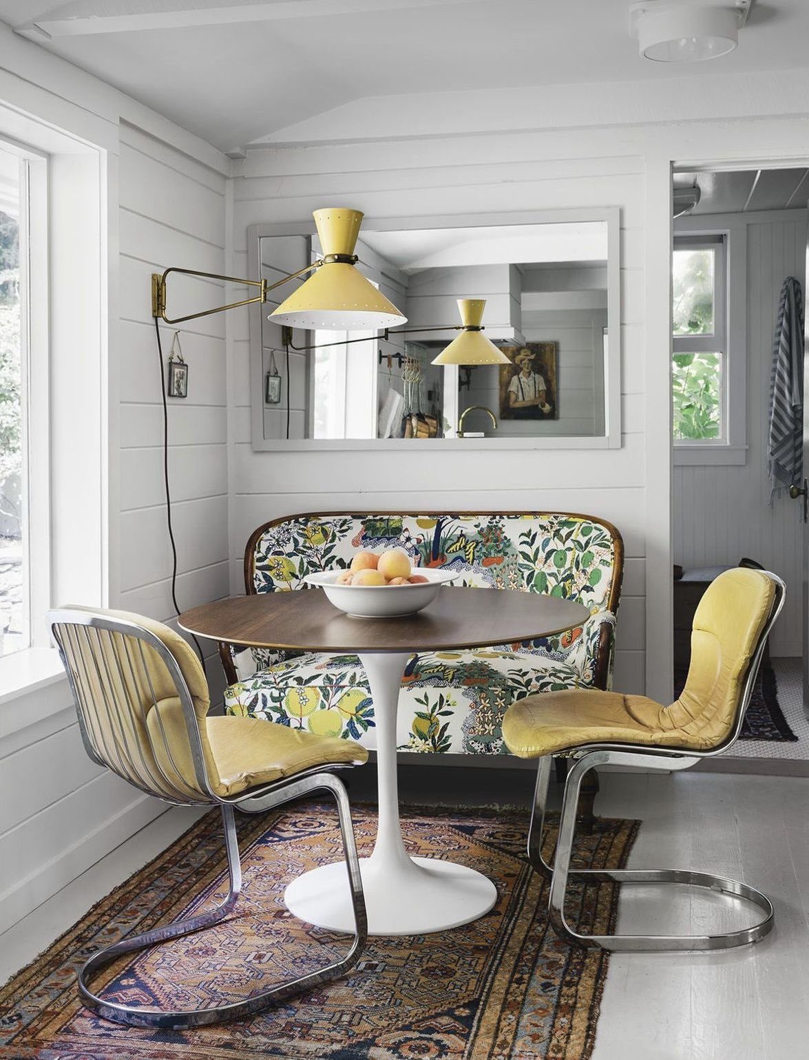
Mixing chair styles around the table loosens the formality of a combined living and dining space. Different shapes and colors keep the dining area from feeling like a separate showroom.
Start with two or three chair types.
Repeat each style at least once so the mix looks intentional rather than accidental. A bench or settee on one side adds another texture without crowding the count.
This approach works especially well in small spaces where every piece needs to earn its spot. Mismatched seating feels less like a dining set and more like part of the living room.
Small dining rooms present both a challenge and an opportunity. On the one hand, you’re working with limited space that’s just one ill-sized dining chair or bar cart away from feeling overwhelmed and cluttered.
4. Banquette Seating
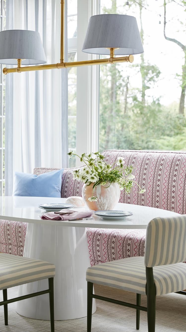
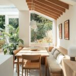
A banquette seats more people in less floor space than individual chairs. Built into a corner or along a wall, it frees up room on the opposite side for traffic between the dining and living areas.
Pair the banquette with a round or oval table so guests can slide in without bumping corners. Add cushions for comfort and to soften the hard edge where the dining zone meets the living zone.
This setup suits small apartments and narrow rooms where a full ring of chairs would block circulation. You gain seating capacity but lose flexibility: a banquette stays put while chairs move.
5. Accent with Art
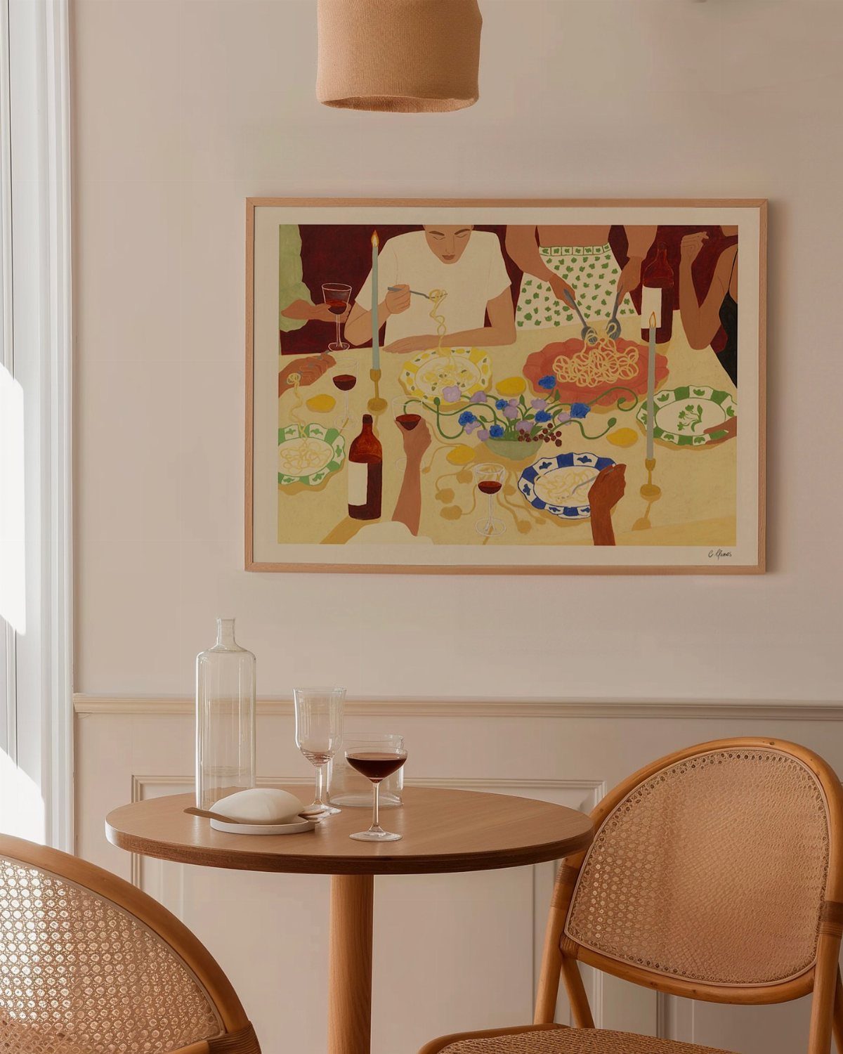
A large painting or framed print above or near the dining table gives the area its own identity in a shared space. Art interrupts the visual flow between zones and signals a shift in function.
Hang the piece low enough that it relates to the table, not the ceiling.
I keep the bottom edge above the tabletop or sideboard, with breathing room between them. Scale up: a single large piece reads stronger than a scattered gallery wall in an open layout.
This works when the dining area lacks architectural separation and needs something vertical to claim the wall.
6. Statement Centerpieces
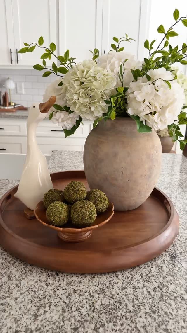
A tall centerpiece draws attention to the dining table and separates it visually from the living room furniture around it.
Flowers, branches or sculptural objects add height and give the table a finished look even when it’s not set for a meal.
Choose a vessel with enough weight that it anchors the arrangement.
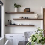
The creator of this one used real touch hydrangeas with greenery for height and fullness. Fresh or faux both work; faux skips the weekly replacement.
Keep the arrangement tall enough to register from a distance but not so tall it blocks conversation when people sit down. A low tray underneath corrals smaller accent pieces and keeps the setup contained.
7. Patterned Wallpaper
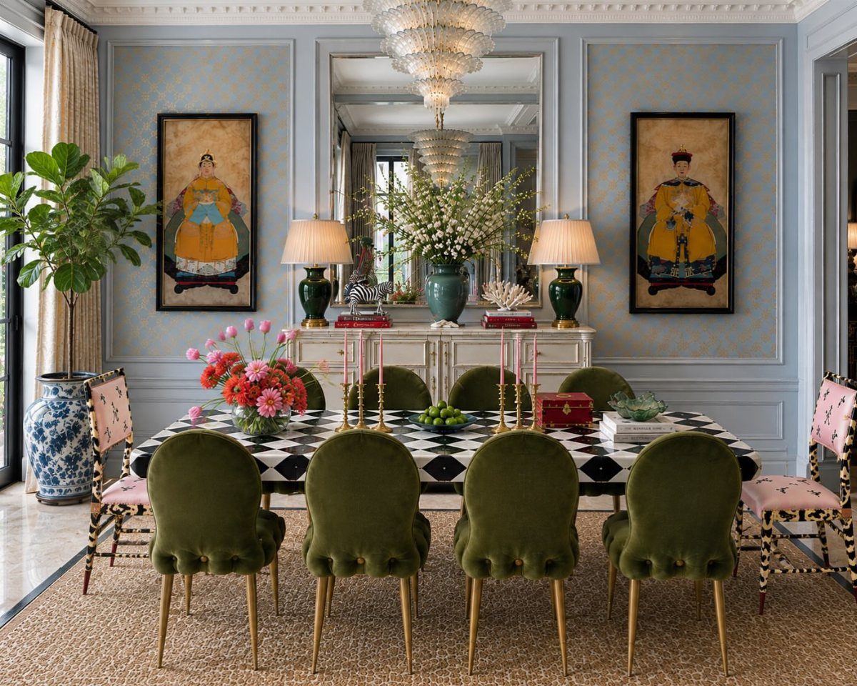
Wallpaper on the wall behind the dining table gives the area its own atmosphere in a shared space. Pattern creates a backdrop that separates the dining zone from the living zone without adding furniture or changing the floor plan.
I prefer darker or busier patterns in dining areas because they hold up better to the visual weight of the table and chairs. Light geometric or floral designs work too, but they need enough contrast to register at any distance.
This is faster than painting an accent wall and adds more texture.
8. Bistro Table
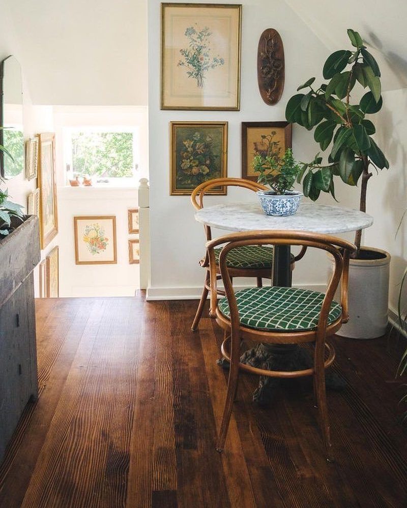
A bistro table fits where a full dining set won’t. Two chairs and a small round top claim less than 3 feet of floor space, leaving room for the living area to breathe.
Marble or wood tops both work.
Marble wipes clean and stays cool, wood weighs less and moves easier. Bentwood or metal chairs keep the profile slim.
This setup suits someone who eats at home most nights and doesn’t host large dinners. You trade seating capacity for floor space.
9. Dining Table Near Windows
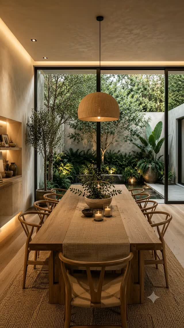
Placing the dining table next to a window pulls natural light into both the dining and living areas. The window becomes the dining zone’s backdrop and gives seated diners something to look at besides the sofa.
Position the table so chairs on the window side don’t block the sill or bump the wall when pulled out. If the window gets strong afternoon sun, add a shade or sheer curtain to cut glare during meals.
This works best when the window wall has enough clearance for circulation behind the chairs.
10. Coffee Table
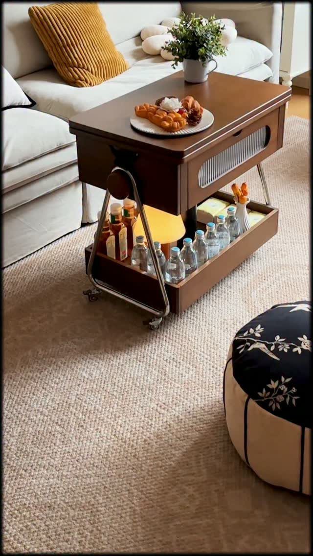
A lift-top coffee table converts the living room into a dining space when the apartment has no room for a separate table.
The top rises and slides forward so you can sit on the sofa and eat at a comfortable height.
Look for one with a sturdy hinge mechanism.
Cheap hardware sags or sticks after a few months of use. The base should have storage underneath for placemats or napkins you’ll need within reach.
This suits studio apartments and tight one-bedrooms where a dining table would block the main traffic path.
11. Painted Ceiling
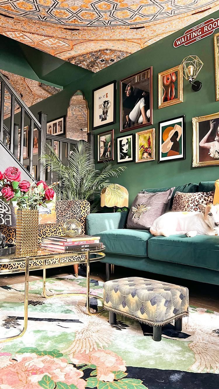
Painting or papering the ceiling separates the dining area overhead when the floor and walls stay continuous. Color or pattern pulls attention upward and marks the dining zone as distinct from the living zone below.
Darker colors make the ceiling feel lower, which tightens the dining area visually.
Light colors or small-scale patterns keep the space open but still add definition. I avoid anything too busy unless the ceiling is high enough to absorb it.
This works when the room has good height and you want separation without touching the walls.
12. Kitchen Hutch
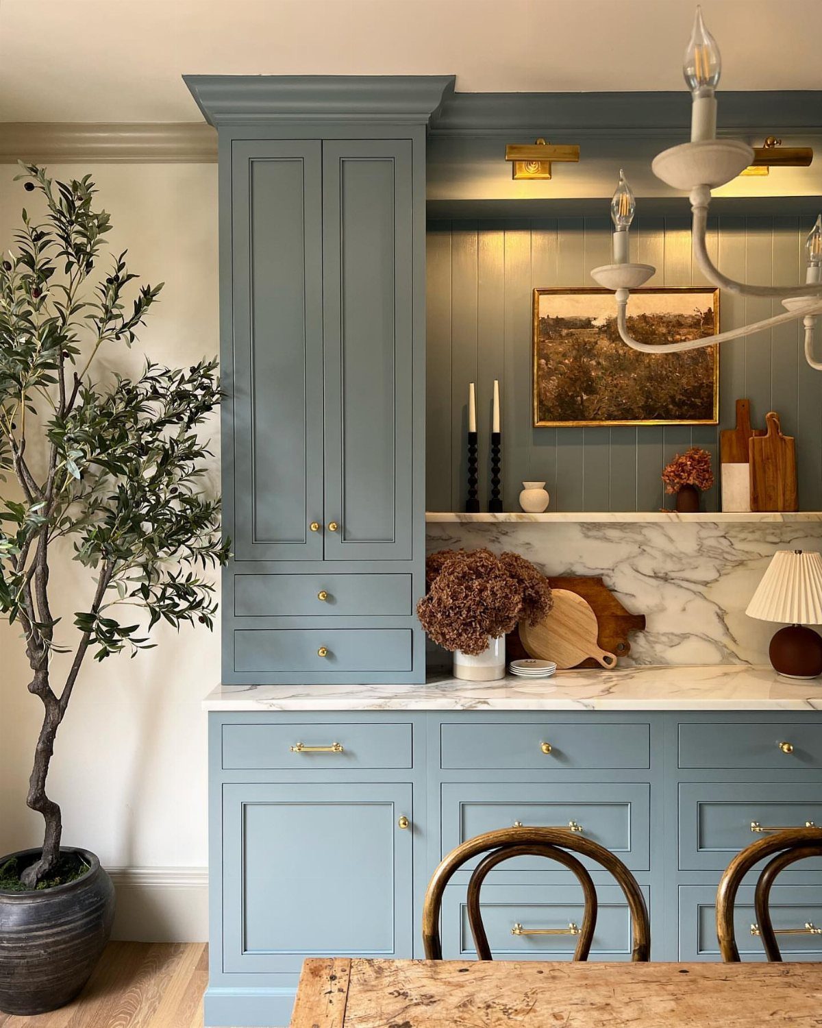
A hutch along one wall stores dishes, glassware and linens within reach of the dining table and adds vertical storage that doesn’t eat into the living area.
The countertop gives you a surface for serving or staging food between the kitchen and table.
Built-ins fit tighter spaces and look intentional, freestanding units move if your layout changes. Either way, size the hutch so it doesn’t overpower the table or block circulation between the 2 zones.
This suits open kitchens where counter space runs short and the dining area needs its own staging spot.
Lighting Importance
Lighting sets the mood and tells a visitor where to look.
Pendant lights with filament bulbs or bubble chandeliers add warmth and give the table a finished look. The glow softens the space and makes it feel intentional rather than accidental.
In a tight apartment where the dining table sits between the kitchen and the sofa, a pendant hung with adhesive hooks can mark the boundary without wiring or cutting into the ceiling.
The light floats above the scene and pulls attention away from the television or the couch.
Space Optimization
Furniture that folds or stacks buys back floor space when the apartment can’t fit a permanent dining table.
C-shaped side tables slide under the sofa arm and pull out for meals, then tuck away when you’re done. They work the way TV trays did but look like part of the room.
A bench on one side of the table seats more people than separate chairs and leaves the opposite side open for traffic.
Modular tables fold flat and store behind a door or against a wall.
Color Schemes
Color marks a zone when the floor plan doesn’t.
The ombré treatment draws the eye straight to the bistro table, giving the dining spot its own identity even when the rest of the room stays light.
Stick to the palette already in the space so the color reads as intentional rather than random.
The color does the work a rug or divider would, but it costs less and takes up no floor space.
Frequently Asked Questions
What is the 3-5-7 rule in decorating?
The 3-5-7 rule suggests grouping decor items in odd numbers for a balanced, intentional look.
Clusters of 3, 5, or 7 objects feel more natural than even pairs. You can apply this to centerpiece arrangements, wall art groupings, or shelves.
What are the dining room decor trends for 2026?
Bold wallpaper, darker paint colors, and multifunctional furniture are taking over dining rooms this year.
Patterned wallpaper behind the table creates separation in open layouts, while lift-top coffee tables and banquettes make small spaces work harder. Natural materials like marble and wood show up in bistro tables and hutches.
What is the 2/3 rule for living rooms?
I hang a fixture at roughly half to two-thirds of the table’s width so the proportions hold.
This proportion keeps the fixture from overwhelming the table or disappearing above it. A rug sized to keep every pulled-out chair leg on its surface keeps the space from looking chopped up.