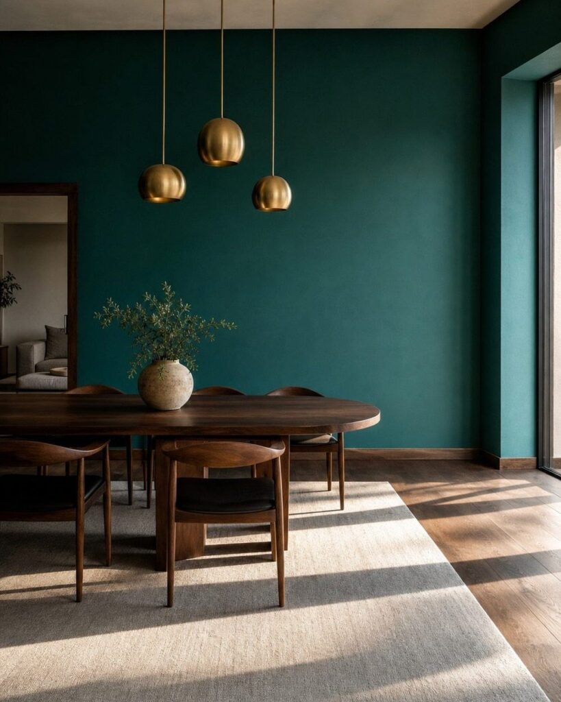
Dining room colors range from soft whites and pinks that maximize light to deep navy and rich browns that anchor the space, with muted greens, grays, terracotta brick red, deep yellow and color blocking between them.
Natural lighting decides the choice: navy and deep yellow need daylight to stay rich, while soft white and soft pink flatter rooms with large windows, and gray tones work across most conditions but read cooler without warm wood or textiles to balance them.
1. Deep Navy Dining Room Colors
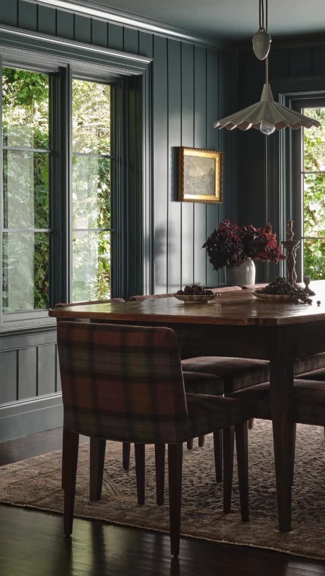
Deep navy walls ground a dining room without reading as black, and paneling adds depth that flat paint cannot match. The color holds up against natural light during the day and feels anchored at night under artificial lighting.
Pair navy with warm wood tones and brass or gold accents to keep the space from feeling cold. Plaid upholstery or woven textures bring in pattern while letting the walls stay the focal point.
If your dining room gets limited natural light, test the color on a sample board first. Navy can go flat in dim corners, but near windows it stays rich.
2. Muted Greens Dining Room Colors
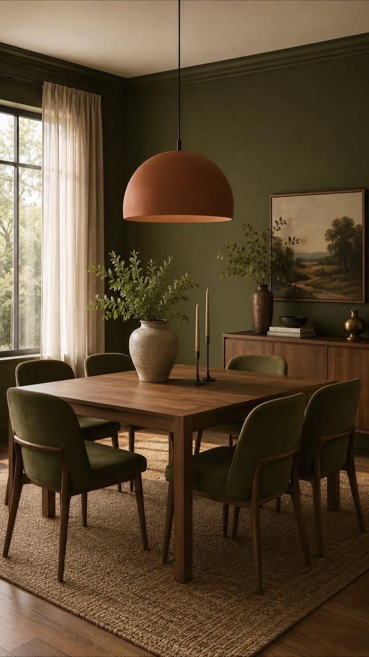
Muted green sits between sage and olive, reading earthy rather than bright. It pairs naturally with wood furniture and terracotta, which warms the cooler tones in the green without clashing.
Green velvet chairs add texture and reinforce the color story without turning the space flat or single-note. A jute rug and terracotta pendant light keep the palette grounded in natural materials.
This shade works well in rooms with good natural light, where the green shifts subtly through the day. In low light, it can lean gray, so test a sample in your space before committing to the full room.
3. Gray Tones
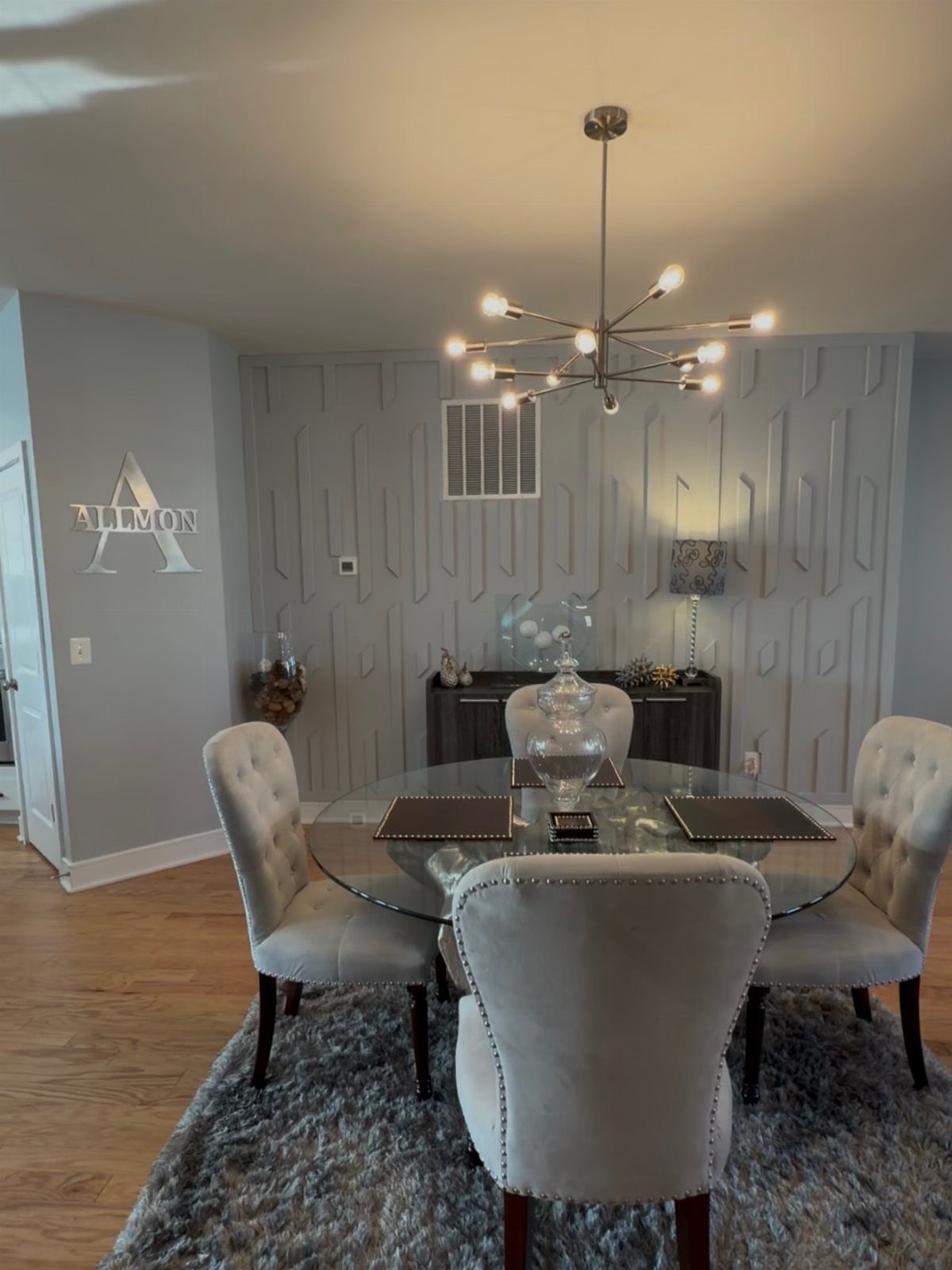
Gray tones provide a sophisticated neutral backdrop that works with nearly any furniture style. Lighter grays reflect natural light and make a room feel larger, while mid-tones add structure without closing in the space.
A glass table keeps the look open, and upholstered chairs in beige or taupe add warmth that prevents the gray from feeling sterile. Modern lighting, like a geometric chandelier, introduces visual interest without adding color.
Gray reads cooler than beige, so balance it with warm wood or soft textiles. In a small dining room, stick to lighter grays to maintain an airy feel.
4. Soft Whites Dining Room Colors
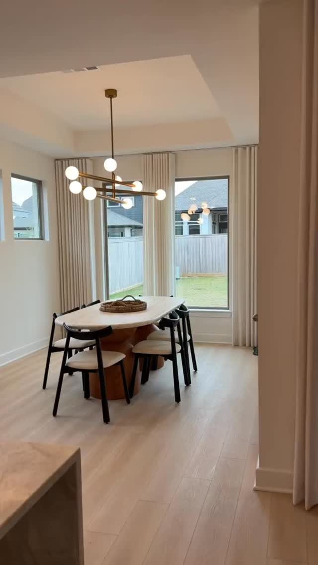
Soft white walls maximize natural light and give furniture and lighting room to stand out. The shade is warmer than pure white, which prevents the clinical look that stark white can bring to a dining room.
Light wood floors and an oval table keep the palette cohesive, while black chairs add contrast without introducing color. A gold chandelier warms the space and catches light while the neutral base holds steady.
This approach works best in rooms with large windows, where natural light keeps the white from feeling flat. In low-light spaces, soft white can read dingy, so test the shade throughout the day.
5. Soft Pinks
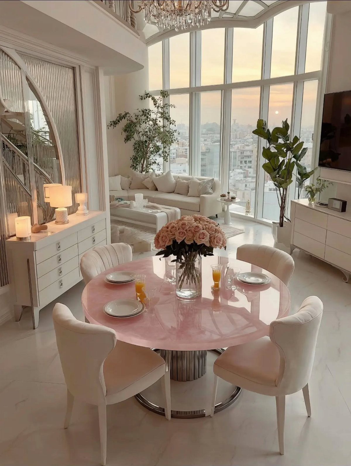
Soft pinks add warmth without being overwhelming, and a pink dining table introduces color at the center of the room rather than on the walls. White chairs and a neutral sofa keep the palette from tipping too bold.
Pairing pink with white and natural wood tones keeps it grounded.
If a pink table feels like too much commitment, try a blush tablecloth or runner instead. Fresh flowers in coordinating shades extend the color story without permanent changes.
6. Deep Yellow
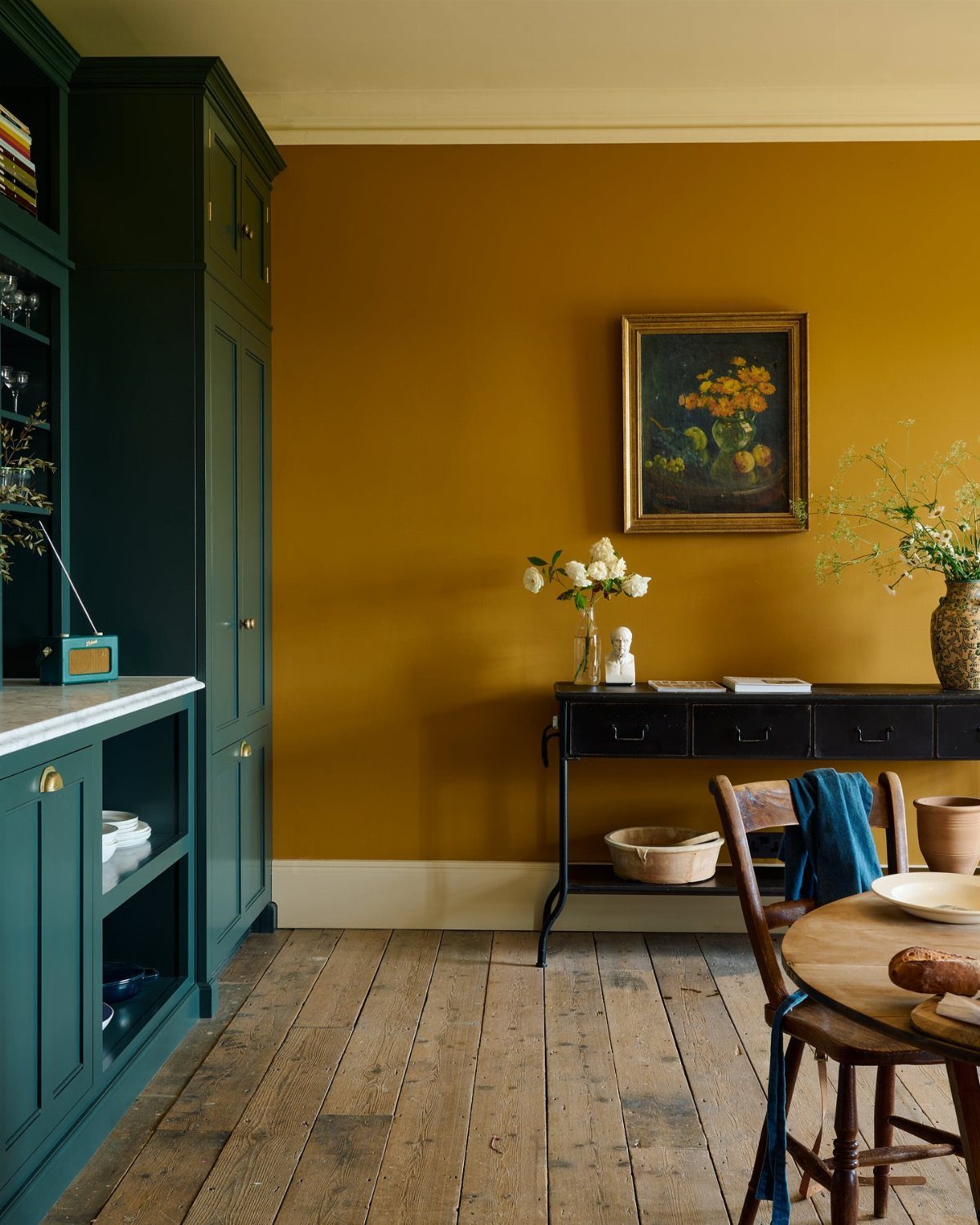
Deep yellow walls bring warmth and energy to a dining room, and the shade reads as ochre or mustard rather than bright lemon. Dark green cabinetry or trim balances the intensity and keeps the yellow from overwhelming the space.
The combination lands somewhere inviting, not loud.
Yellow can shift dramatically under different lighting, so test a sample in both daylight and evening conditions before painting the full room.
7. Color Blocking
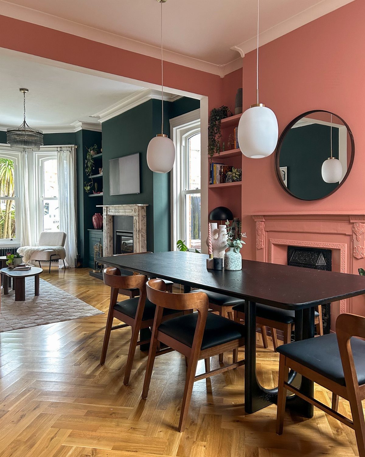
Color blocking splits the wall into 2 contrasting shades, each carrying its own weight. Terracotta and dark green anchor each other without fighting for attention, and the line where they meet defines the space without trim or molding.
The approach works when both colors have similar depth. One light and one dark reads more like wainscoting than blocking.
Run the division at a height that follows the room’s proportions.
Halfway can look arbitrary; aligning the split with the top of a door frame or the back of the chairs gives the line a reason to sit where it does.
8. Rich Browns
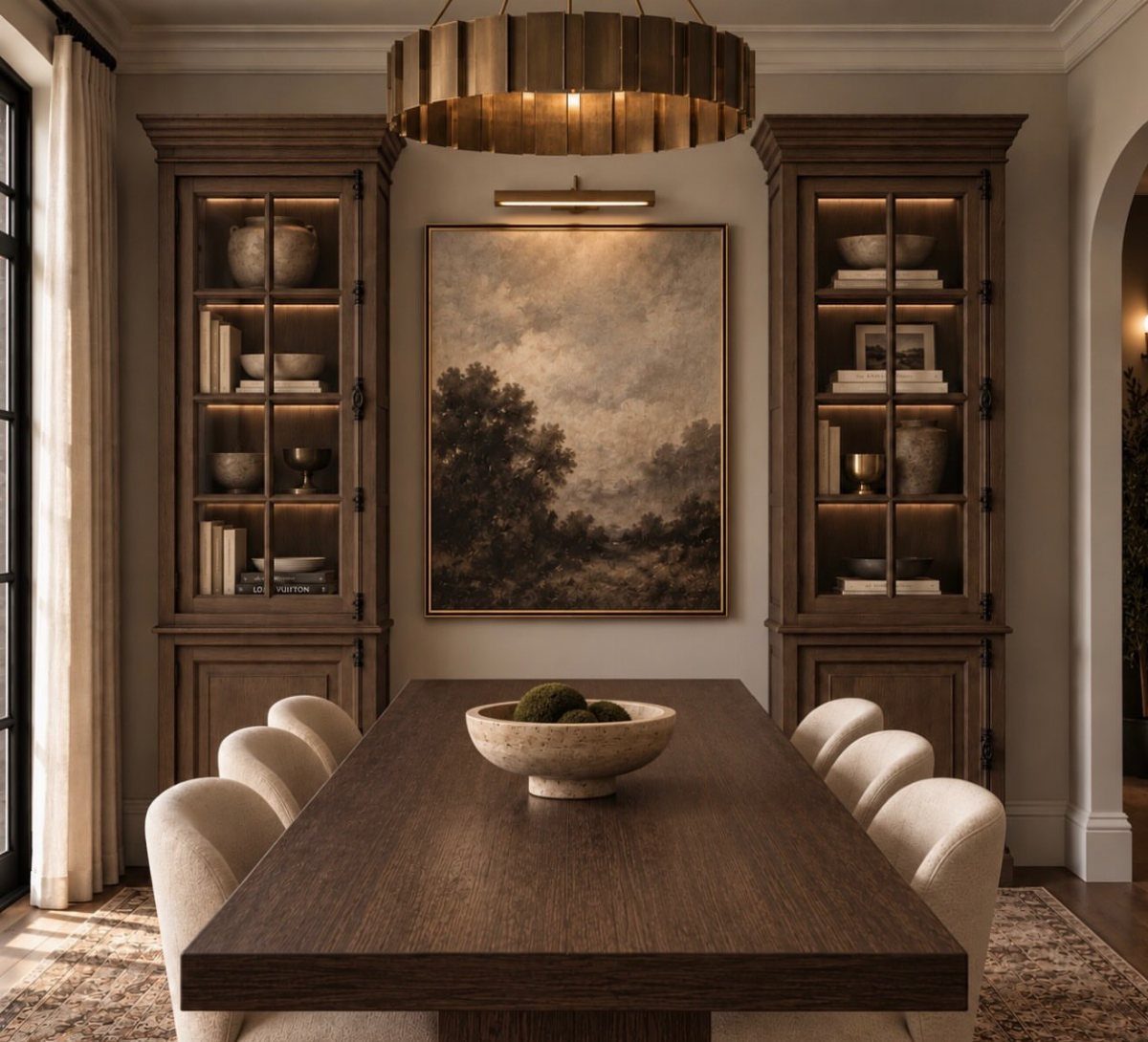
Rich brown cabinetry and furniture create a cohesive, enclosed feel that works well in larger dining rooms where the weight of dark wood adds structure rather than shrinking the space.
Cream upholstery keeps the brown from reading too heavy, and gold lighting warms the palette without introducing a new color family. The contrast between dark wood and soft neutrals defines the room more clearly than an all-brown approach would.
In smaller dining rooms, this much brown can close in quickly. Limit it to the table and chairs, then balance with lighter walls.
9. Terracotta Brick Red Dining Room
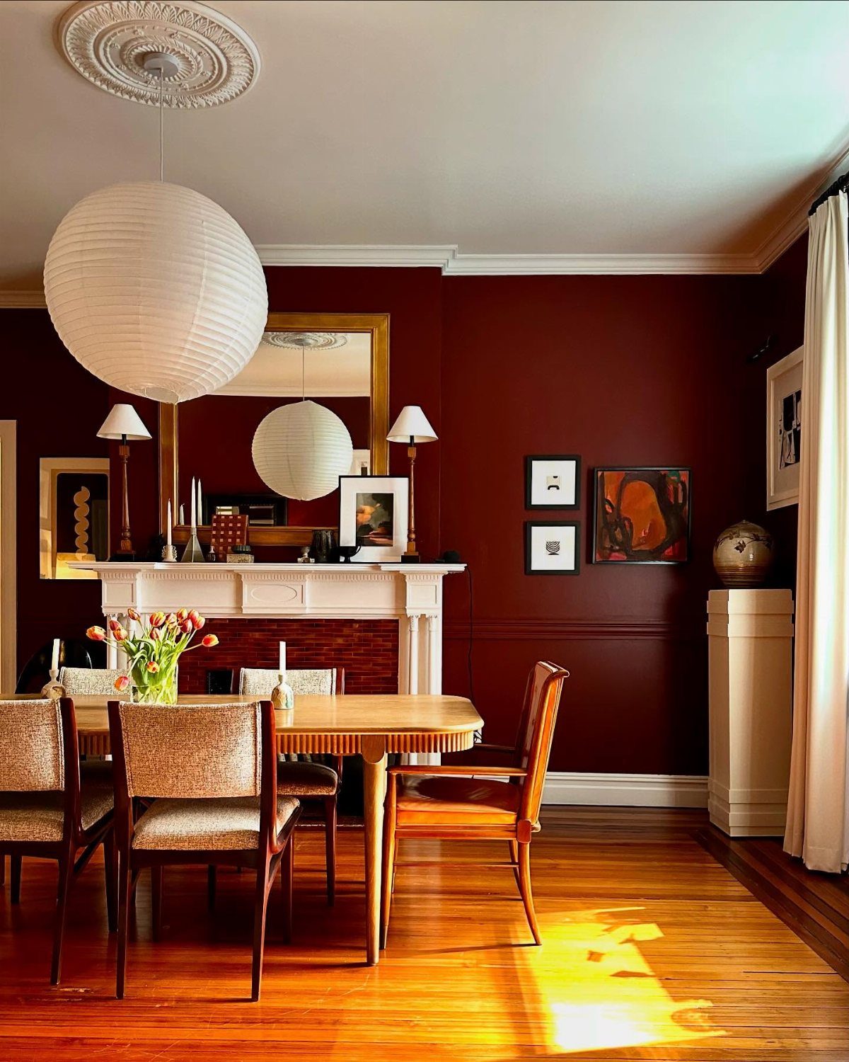
Terracotta brick red brings warmth and presence to a dining room without the sharpness of true red. The chalky, earthy tone pairs naturally with wood and stays grounded rather than bright.
A white fireplace or trim keeps the red from overwhelming the space, and natural materials like a paper lantern or jute rug soften the intensity. The shade shifts under different lighting, reading richer at night and softer during the day.
This color works best on one accent wall if the room is small. Full coverage suits larger spaces where the red has room to settle.
Consider Natural Lighting
Artificial lighting matters just as much, since most dining rooms see use at night. Incandescent or warm LED fixtures push reds and yellows forward, while daylight-balanced bulbs bring out grays and blues and flatten anything orange or terracotta.
When the dining room opens onto a kitchen or hallway, step back and check how the color looks from those sight lines before you commit. A shade that works in isolation can clash when viewed through a doorway.
Test Paint Colors
Testing paint samples in your own space shows how a color performs under your specific lighting and next to your furniture.
Paint reads differently on a chip in the store than it does on your wall, where natural light, ceiling height, and surrounding materials all shift the tone.
Apply samples to multiple walls if the room gets uneven light. A color near a window may look completely different on the opposite wall in shadow.
Check the sample at different times of day and again in the evening under your usual lighting. A shade that feels right at noon can fall flat or turn too intense after dark.